Component:ContactItem
The ContactItem component is used in the contacts tab of the Dash Menu to be a contact in the list of contacts on that screen.
More actions
Component image 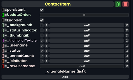
Contact Item component as seen in the Scene Inspector

The ContactItem component is used in the contacts tab of the Dash Menu to be a contact in the list of contacts on that screen.
Fields
| Name | Type | Description |
|---|---|---|
persistent
|
Bool | Determines whether or not this item will be saved to the server. |
UpdateOrder
|
Int | Controls the order in which this component is updated. |
Enabled
|
Bool | Controls whether or not this component is enabled. Some components stop their functionality when this field is disabled, but some don't. |
_background
|
Image | The background element of the contact item. |
_statusIndicator
|
Image | The image used to indicate the user status of the contact item. |
_thumbnail
|
Image | The thumbnail Component of that user's profile picture. |
_thumbnailTexture
|
StaticTexture2D | The texture being used to show a user's profile picture. |
_username
|
Text | The text showing the user's username. |
_status
|
Text | The text showing the user's status. |
_unreadCount
|
Text | The text showing the number of unread messages from the user. |
_joinButton
|
Button | The button that can be used to join the user. |
_rawUsername
|
String | The raw string of the user's username without ignore tags. |
_alternateNames
|
direct SyncFieldList`1<String> | A list of names the user may have had before. |
Sync Delegates
| Method Name | Method type and Arguments. | Is the method hidden? | Description |
|---|---|---|---|
OnJoin:ButtonEventHandler
|
ButtonEventHandler | ✓ | What to run when joining the user that corrosponds to this contact item. |
Usage
See Dash Menu.
Examples
See Dash Menu.