Component:DesktopScreen
The DesktopScreen component is used to make the behavior of the desktop tab on the Dash Menu.
More actions
Component image 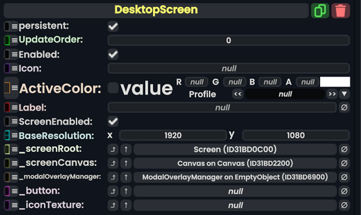
Desktop Screen component as seen in the Scene Inspector

The DesktopScreen component is used to make the behavior of the desktop tab on the Dash Menu.
Fields
| Name | Type | Description |
|---|---|---|
persistent
|
Bool | Determines whether or not this item will be saved to the server. |
UpdateOrder
|
Int | Controls the order in which this component is updated. |
Enabled
|
Bool | Controls whether or not this component is enabled. Some components stop their functionality when this field is disabled, but some don't. |
Icon
|
Uri | The icon of the dash menu tab. |
ActiveColor
|
Nullable`1<ColorX> | The color when this dash menu screen tab is selected. |
Label
|
String | The text for this dash menu Screen tab. |
ScreenEnabled
|
Bool | Whether the screen is enabled for viewing. |
BaseResolution
|
Float2 | The default resolution of the tab screen. |
_screenRoot
|
Slot | The root slot of the desktop screen view. |
_screenCanvas
|
Canvas | The canvas being used for the tab view. |
_modalOverlayManager
|
ModalOverlayManager | The Overlay manager being used for handling edit mode. |
_button
|
RadiantDashButton | The button to select this dash menu screen tab. |
_iconTexture
|
Texture2D | The texture being used for the icon of this dash menu tab. |
Usage
Used in the dash menu. Not used by the user directly.
Examples
Used in the dash menu.