Your IP address will be publicly visible if you make any edits.
Component:LegacyProgressBar
The LegacyProgressBar component was used in old progress bars for importing items or for cloud storage indicators. This should not be used for new content and should be removed when possible.
More actions
This article describes a feature marked as legacy—this usually means there's a newer, better alternative. Legacy features might not be removed but they will not be updated, and the team will not provide any support for them.
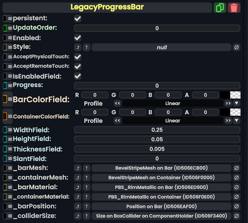
Component image
Legacy Progress Bar component as seen in the Scene Inspector
The LegacyProgressBar component was used in old progress bars for importing items or for cloud storage indicators. This should not be used for new content and should be removed when possible.