Component image 
Legacy Radio Group component as seen in the Scene Inspector

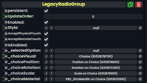
The LegacyRadioGroup component was used to manage multiple Legacy Radios as part of a list of exclusive options. This component is a part of migrated content and should not be used in new content. This component should be replaced whenever possible.
Fields
Name | Type | Description |
---|---|---|
persistent
|
Bool | Determines whether or not this item will be saved to the server. |
UpdateOrder
|
Int | Controls the order in which this component is updated. |
Enabled
|
Bool | Controls whether or not this component is enabled. Some components stop their functionality when this field is disabled, but some don't. |
Style
|
direct RelayRef`1<LegacyUIStyle> | The source of the legacy color styles for this component. |
AcceptPhysicalTouch
|
Bool | Whether to allow Component:TipTouchSources to interact with/activate this component. |
AcceptRemoteTouch
|
Bool | Whether this component allows interaction via the user's interaction laser. |
IsEnabled
|
Bool | Whether this Legacy UI element is enabled and usable. |
_selectedOption
|
LegacyRadio | The Legacy Radio this component has as the chosen option. |
_choiceVisual
|
Slot | the slot of the choice check mark. |
_choicePosition
|
field drive of Float3 | The field to drive to position the check mark. |
_choiceRotation
|
field drive of FloatQ | The field to drive for the check mark's rotation. |
_choiceScale
|
field drive of Float3 | The field to drive for the check mark's scale. |
_choiceMaterial
|
reference drive of PBS_RimMetallic | The material of the check mark visual. |
Usage
Just dont.
Examples
This article or section is a Stub. You can help the Resonite Wiki by expanding it.