Component:LegacySlider
The LegacySlider component was used in old legacy content to act as a UI for adjusting a float via a slider. This component should not be used in new content and should be replaced whenever possible.
More actions
Component image 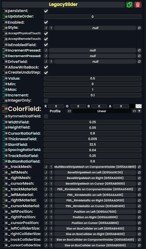
Legacy Slider component as seen in the Scene Inspector

The LegacySlider component was used in old legacy content to act as a UI for adjusting a float via a slider. This component should not be used in new content and should be replaced whenever possible.
Usage
| Name | Type | Description |
|---|---|---|
persistent
|
Bool | Determines whether or not this item will be saved to the server. |
UpdateOrder
|
Int | Controls the order in which this component is updated. |
Enabled
|
Bool | Controls whether or not this component is enabled. Some components stop their functionality when this field is disabled, but some don't. |
Style
|
direct RelayRef`1<LegacyUIStyle> | The source of the legacy color styles for this component. |
AcceptPhysicalTouch
|
Bool | Whether to allow Component:TipTouchSources to interact with/activate this component. |
AcceptRemoteTouch
|
Bool | Whether this component allows interaction via the user's interaction laser. |
IsEnabledField
|
Bool | Whether this Legacy UI element is enabled and usable. |
IncrementPressed
|
delegate of identity Action`1<LegacySlider> | The Sync delegate to call when the increment button is pressed, passing this component as an argument. |
DecrementPressed
|
delegate of identity Action`1<LegacySlider> | The Sync delegate to call when the decrement button is pressed, passing this component as an argument. |
DriveField
|
field drive of Float | The float field to drive with Value
|
AllowWriteBack
|
Bool | Whether changes to the value of the field targeted by DriveField should be written back to Value.
|
CreateUndoStep
|
Bool | Whether using this UI creates an Undo step. |
Value
|
Float | The value this component is influencing. |
Min
|
Float | The minimum value for Value.
|
Max
|
Float | The maximum value for Value.
|
Increment
|
Float | How much to shift Value by when using the slider side buttons.
|
IntegerOnly
|
Bool | Whether Value can only be a whole number.
|
ColorField
|
ColorX | The color of this UI. |
SymmetricalField
|
Bool | whether this UI should be symmetrical. |
WidthField
|
Float | The width of this UI. |
HeightField
|
Float | The height of this UI. |
CursorRatioField
|
Float | the size of the slider cursor compared to the slider container. |
ThicknessField
|
Float | the thickness of the UI. |
SlantField
|
Float | How beveled the UI is. |
SpacingRatioField
|
Float | How to space out the center UI and its buttons. |
TrackRatioField
|
Float | How big the slider track should be compared to the UI. |
ButtonRatioField
|
Float | How big the buttons should be compared to the slider. |
_trackMesh
|
reference drive of MultiBevelStripeMesh | The mesh for the slider track. |
_leftMesh
|
reference drive of BevelStripeMesh | The mesh for the left button. |
_rightMesh
|
reference drive of BevelStripeMesh | The mesh for the right button. |
_cursorMesh
|
reference drive of BevelStripeMesh | The mesh for the slider cursor. |
_trackMaterial
|
reference drive of PBS_RimMetallic | The material of the slider track. |
_leftMaterial
|
reference drive of PBS_RimMetallic | The material of the left button. |
_rightMaterial
|
reference drive of PBS_RimMetallic | The material of the right button. |
_cursorMaterial
|
reference drive of PBS_RimMetallic | The material of the slider cursor. |
_leftPosition
|
field drive of Float3 | The position field of the left button. |
_rightPosition
|
field drive of Float3 | The position field of the right button. |
_cursorPosition
|
field drive of Float3 | The position field of the cursor. |
_leftColliderSize
|
field drive of Float3 | The size field of the left button's collider. |
_rightColliderSize
|
field drive of Float3 | The size field of the right button's collider. |
_trackColliderSize
|
field drive of Float3 | The size field of the track's collider. |
_cursorColliderSize
|
field drive of Float3 | The size field of the cursor's collider. |
Sync Delegates
| Method Name | Method type and Arguments. | Is the method hidden? | Description |
|---|---|---|---|
LeftOnTouch:TouchEvent
|
TouchEvent | ✓ | Called when the left button is touched. |
RightOnTouch:TouchEvent
|
TouchEvent | ✓ | Called when the right button is touched. |
Usage
Just dont.
Examples
This article or section is a stub. You can help the Resonite wiki by expanding it.