Component:TouchToggle
The TouchToggle component acts as a button that works as a check box, and the different Toggle on and off action can be mapped to certain Touch events.
More actions
Component image 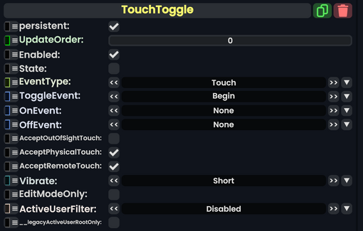
Touch Toggle component as seen in the Scene Inspector

The TouchToggle component acts as a button that works as a check box, and the different Toggle on and off action can be mapped to certain Touch events.
Fields
| Name | Type | Description |
|---|---|---|
persistent
|
Bool | Determines whether or not this item will be saved to the server. |
UpdateOrder
|
Int | Controls the order in which this component is updated. |
Enabled
|
Bool | Controls whether or not this component is enabled. Some components stop their functionality when this field is disabled, but some don't. |
State
|
Bool | The checkbox state of this touch toggle. |
EventType
|
TouchEventType | the type of touch event to listen for different event states from. |
ToggleEvent
|
EventState | The event state needed when touching to Toggle the State value.
|
OnEvent
|
EventState | The event state needed when touching to switch to true the State value.
|
OffEvent
|
EventState | The event state needed when touching to switch to false the State value.
|
AcceptOutOfSightTouch
|
Bool | Whether or not to allow interaction with this component if it is out of the user's view. |
AcceptPhysicalTouch
|
Bool | Whether to allow Component:TipTouchSources to interact with/activate this component. |
AcceptRemoteTouch
|
Bool | Whether this component allows interaction via the user's interaction laser. |
Vibrate
|
VibratePreset | How to vibrate the user's hand when they touch the toggle. |
EditModeOnly
|
Bool | Whether this is only available in edit mode. |
ActiveUserFilter
|
ActiveUserHandling | how to filter users in the session who can interact with this component depending on the parent user. |
__legacyActiveUserRootOnly
|
Bool | Whether to use the legacy active user root. Internal. |
Usage
This article or section is a stub. You can help the Resonite wiki by expanding it.