Component:WorldCloseScreen
From Resonite Wiki
More actions
Component image 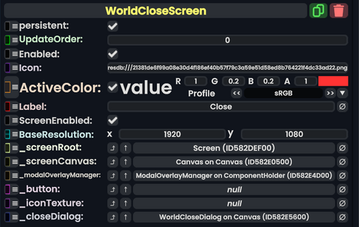
World Close Screen component as seen in the Scene Inspector

The World Close Screen component is used in the dash and appears when the user asks to close a world. This acts as a conformation. This is also an internally used component.
Fields
| Name | Type | Description |
|---|---|---|
persistent
|
Bool | Determines whether or not this item will be saved to the server. |
UpdateOrder
|
Int | Controls the order in which this component is updated. |
Enabled
|
Bool | Controls whether or not this component is enabled. Some components stop their functionality when this field is disabled, but some don't. |
Icon
|
Uri | The icon for this dialogue screen. |
ActiveColor
|
Nullable`1<ColorX> | The color when this screen is selected and active. |
Label
|
String | The label of this dash screen. |
ScreenEnabled
|
Bool | Whether this dash screen is enabled or not. |
BaseResolution
|
Float2 | The resolution this screen renders at. |
_screenRoot
|
Slot | The root slot of this screen's visual elements. |
_screenCanvas
|
Canvas | The canvas Component used to render this dash screen. |
_modalOverlayManager
|
ModalOverlayManager | This is the Overlay manager that handles editing mode on this screen. |
_button
|
RadiantDashButton | This is the button to switch to viewing this screen. |
_iconTexture
|
Texture2D | This is the texture Component showing the icon for the tab of this screen. |
_closeDialog
|
WorldCloseDialog | The close dialog this is controlling. |
Usage
Not used by the user, is an internally used component.
Examples
Used for the world close dialog in the dash when closing a world.