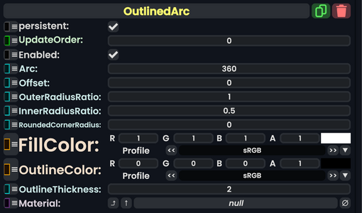
The '''OutlinedArc''' component takes in many parameters to create a circular image or design and can be controlled using those parameters. Then this renders onto the [[UIX]].
<!--T:3-->
<!--T:3-->
== Usage ==
{{Table ComponentFields
{{Table ComponentFields
|Arc|Float|
|Arc|Float|The amount to arc around the center.
|Offset|Float|
|Offset|Float|The amount to rotate around the center.
|OuterRadiusRatio|Float|
|OuterRadiusRatio|Float|The outer distance for this arc from the center.
|InnerRadiusRatio|Float|
|InnerRadiusRatio|Float|The inner distance for this arc from the center.
|FillColor|Color|
|RoundedCornerRadius|Float|The amount of how rounded the edges of the arc end points are.
|OutlineColor|Color|
|FillColor|ColorX|The inner color (filled in color) of this arc.
|OutlineThickness|Float|
|OutlineColor|ColorX|The outer color (the outline) of this arc.
|Material|Material|
|OutlineThickness|Float|The amount to thicken for the outline.
|Material|{{RootFieldType|AssetRef`1|[[Type:Material|Material]]}}|TypeAdv8=true|Uses a material for the arc.
}}
}}
<!--T:4-->
<!--T:4-->
== Behavior ==
== Usage ==
A user could make fancy effects like a [https://en.wikipedia.org/wiki/Throbber loading circular throbber], or menu buttons that arc around.
<!--T:5-->
<!--T:5-->
== Examples ==
== Examples ==
Similar to how the [[Context menu|context menu]] arcs around.
<!--T:6-->
<!--T:6-->
== Related Components ==
== Related Components ==
* [[:Category:Components:Radiant UI:Context Menu|Context menu components]]
The OutlinedArc component takes in many parameters to create a circular image or design and can be controlled using those parameters. Then this renders onto the UIX.