add info |
template |
||
| Line 2: | Line 2: | ||
<translate> | <translate> | ||
<!--T:1--> | <!--T:1--> | ||
{{Infobox Component | {{Infobox Component | ||
|Image=TouchButtonComponent.png | |Image=TouchButtonComponent.png | ||
| Line 14: | Line 13: | ||
|IsPressed|Bool| Whether the button is pressed or not | |IsPressed|Bool| Whether the button is pressed or not | ||
|IsHovering|Bool| Whether the button is being pointed at with the laser in the case of a touch button | |IsHovering|Bool| Whether the button is being pointed at with the laser in the case of a touch button | ||
|AcceptPhysicalTouch|Bool| | |AcceptPhysicalTouch|Bool| {{Template:Touchable_AcceptPhysicalTouch}} | ||
|AcceptRemoteTouch|Bool| | |AcceptRemoteTouch|Bool| {{Template:Touchable_AcceptRemoteTouch}} | ||
|AcceptOutOfSightTouch|Bool| | |AcceptOutOfSightTouch|Bool| {{Template:Touchable_AcceptOutOfSightTouch}} | ||
|EditModeOnly|Bool| Whether this button will only work if the user is in [[Edit Mode]] | |EditModeOnly|Bool| Whether this button will only work if the user is in [[Edit Mode]] | ||
|ActiveUserFilter|ActiveUserHandling| How to handle user interaction depending on active user. | |ActiveUserFilter|ActiveUserHandling| How to handle user interaction depending on active user. | ||
Latest revision as of 17:28, 21 January 2025
Component image 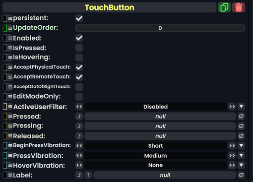
Touch Button component as seen in the Scene Inspector

The TouchButton component is used to make a physical button with no press depth that is instantly pressable upon click or touch. For a button with press depth, please see PhysicalButton.
Fields
| Name | Type | Description |
|---|---|---|
persistent
|
Bool | Determines whether or not this item will be saved to the server. |
UpdateOrder
|
Int | Controls the order in which this component is updated. |
Enabled
|
Bool | Controls whether or not this component is enabled. Some components stop their functionality when this field is disabled, but some don't. |
IsPressed
|
Bool | Whether the button is pressed or not |
IsHovering
|
Bool | Whether the button is being pointed at with the laser in the case of a touch button |
AcceptPhysicalTouch
|
Bool | Whether to allow Component:TipTouchSources to interact with/activate this component. |
AcceptRemoteTouch
|
Bool | Whether this component allows interaction via the user's interaction laser. |
AcceptOutOfSightTouch
|
Bool | Whether or not to allow interaction with this component if it is out of the user's view. |
EditModeOnly
|
Bool | Whether this button will only work if the user is in Edit Mode |
ActiveUserFilter
|
ActiveUserHandling | How to handle user interaction depending on active user. |
Pressed
|
delegate of identity ButtonEventHandler | The Sync Delegate to call when the button is pressed. |
Pressing
|
delegate of identity ButtonEventHandler | The Sync Delegate to call when the button is being pressed every game tick. |
Released
|
delegate of identity ButtonEventHandler | The Sync Delegate to call when the button is released. |
BeginPressVibration
|
VibratePreset | What vibration to send when this button is starting to be pressed. |
PressVibration
|
VibratePreset | What vibration to send when this button is pressed. |
HoverVibration
|
VibratePreset | What vibration to send when this button is hovered over via laser. |
Label
|
IField`1<String> | The field that represents this button's label. |
Usage
Used in boopers and buttons where PhysicalButton is a bad choice because the button press needs to have no press depth. In the case where the user does want press depth, use PhysicalButton.
Examples
This article or section is a stub. You can help the Resonite wiki by expanding it.
See Also
- IButton For a list of button types.