|_textBounds|{{RootFieldType|FieldDrive`1|[[Type:Float2|Float2]]}}|TypeAdv13=true| The field to drive to make the UI fit around the text.
|_textBounds|{{RootFieldType|FieldDrive`1|[[Type:Float2|Float2]]}}|TypeAdv13=true| The field to drive to make the UI fit around the text.
|_colliderSize|{{RootFieldType|FieldDrive`1|[[Type:Float3|Float3]]}}|TypeAdv14=true| The field of the collider size for this UI.
|_colliderSize|{{RootFieldType|FieldDrive`1|[[Type:Float3|Float3]]}}|TypeAdv14=true| The field of the collider size for this UI.
|_meshLeft|{{RootFieldType|DriveRef`1|[[Component:BevelStripeMesh|BevelStripeMesh]]}}|TypeAdv15=true| The mesh being used by this component's left button.
|_meshLeft|{{RootFieldType|DriveRef`1|[[Component:BevelStripeMesh|BevelStripeMesh]]}}|TypeAdv15=true| The mesh being used by this component's left button.
|_meshRight|{{RootFieldType|DriveRef`1|[[Component:BevelStripeMesh|BevelStripeMesh]]}}|TypeAdv16=true| The mesh being used by this component's right button.
|_meshRight|{{RootFieldType|DriveRef`1|[[Component:BevelStripeMesh|BevelStripeMesh]]}}|TypeAdv16=true| The mesh being used by this component's right button.
|_textLeftBounds|{{RootFieldType|FieldDrive`1|[[Type:Float2|Float2]]}}|TypeAdv17=true| The field to drive to make the left button stay wrapped around its text.
|_textLeftBounds|{{RootFieldType|FieldDrive`1|[[Type:Float2|Float2]]}}|TypeAdv17=true| The field to drive to make the left button stay wrapped around its text.
|_textRightBounds|{{RootFieldType|FieldDrive`1|[[Type:Float2|Float2]]}}|TypeAdv18=true| The field to drive to make the right button stay wrapped around its text.
|_textRightBounds|{{RootFieldType|FieldDrive`1|[[Type:Float2|Float2]]}}|TypeAdv18=true| The field to drive to make the right button stay wrapped around its text.
Line 43:
Line 43:
|IsEnabled|Bool| {{Template:LegacyUI_IsEnabled}}
|IsEnabled|Bool| {{Template:LegacyUI_IsEnabled}}
|_textDrive|{{RootFieldType|FieldDrive`1|[[Type:String|String]]}}|TypeAdv35=true| The string field to drive with the current <code>Value</code> for the visuals.
|_textDrive|{{RootFieldType|FieldDrive`1|[[Type:String|String]]}}|TypeAdv35=true| The string field to drive with the current <code>Value</code> for the visuals.
}}
== Sync Delegates ==
{{Table ComponentTriggers
|EditingStarted:[[Type:Action`1|Action`1]]<[[Component:TextEditor|TextEditor]]>|[[Type:Action`1|Action`1]]<[[Component:TextEditor|TextEditor]]>|true| Called when the number field is focused into.
|EditingChanged:[[Type:Action`1|Action`1]]<[[Component:TextEditor|TextEditor]]>|[[Type:Action`1|Action`1]]<[[Component:TextEditor|TextEditor]]>|true| Called when the number field is changed.
|EditingFinished:[[Type:Action`1|Action`1]]<[[Component:TextEditor|TextEditor]]>|[[Type:Action`1|Action`1]]<[[Component:TextEditor|TextEditor]]>|true| Called when the number field has stopped being edited.
|OnLeftTouched:[[Type:TouchEvent|TouchEvent]]|[[Type:TouchEvent|TouchEvent]]|true| Called when the left button is touched.
|OnRightTouched:[[Type:TouchEvent|TouchEvent]]|[[Type:TouchEvent|TouchEvent]]|true| Called when the right button is touched.
}}
}}
Line 49:
Line 58:
== Examples ==
== Examples ==
{{stub}}
Found in legacy content.
== See Also ==
== See Also ==
Latest revision as of 03:44, 7 April 2025
This article describes a feature marked as legacy—this usually means there's a newer, better alternative. Legacy features might not be removed but they will not be updated, and the team will not provide any support for them.
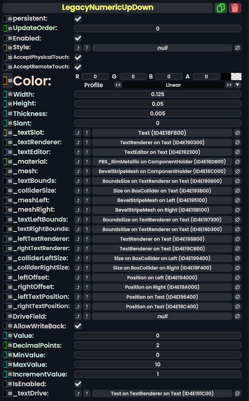
Component image
Legacy Numeric Up Down component as seen in the Scene Inspector
The LegacyNumericUpDown component comes from Legacy migrated content. This component should not be used in new content, and should be removed when possible.