Automated: create new component page |
No edit summary |
||
| (4 intermediate revisions by 2 users not shown) | |||
| Line 1: | Line 1: | ||
{{Infobox Component | {{Legacy}}{{Infobox Component | ||
|Image=LegacySliderComponent.png | |Image=LegacySliderComponent.png | ||
|Name=Legacy Slider | |Name=Legacy Slider | ||
}} | }} | ||
The '''LegacySlider''' component was used in old legacy content to act as a UI for adjusting a float via a slider. This component should not be used in new content and should be replaced whenever possible. | |||
== Usage == | == Usage == | ||
{{Table ComponentFields | {{Table ComponentFields | ||
|Style|{{RootFieldType|RelayRef`1|[[Component:LegacyUIStyle|LegacyUIStyle]]}}|TypeAdv0=true| | |Style|{{RootFieldType|RelayRef`1|[[Component:LegacyUIStyle|LegacyUIStyle]]}}|TypeAdv0=true| {{Template:LegacyUI_Style}} | ||
|AcceptPhysicalTouch|Bool| | |AcceptPhysicalTouch|Bool| {{Template:Touchable_AcceptPhysicalTouch}} | ||
|AcceptRemoteTouch|Bool| | |AcceptRemoteTouch|Bool| {{Template:Touchable_AcceptRemoteTouch}} | ||
|IsEnabledField|Bool| | |IsEnabledField|Bool| {{Template:LegacyUI_IsEnabled}} | ||
|IncrementPressed|{{RootFieldType|SyncDelegate`1|[[Type:Action`1|Action`1]]<[[Component:LegacySlider|LegacySlider]]>}}|TypeAdv4=true| | |IncrementPressed|{{RootFieldType|SyncDelegate`1|[[Type:Action`1|Action`1]]<[[Component:LegacySlider|LegacySlider]]>}}|TypeAdv4=true| The Sync delegate to call when the increment button is pressed, passing this component as an argument. | ||
|DecrementPressed|{{RootFieldType|SyncDelegate`1|[[Type:Action`1|Action`1]]<[[Component:LegacySlider|LegacySlider]]>}}|TypeAdv5=true| | |DecrementPressed|{{RootFieldType|SyncDelegate`1|[[Type:Action`1|Action`1]]<[[Component:LegacySlider|LegacySlider]]>}}|TypeAdv5=true| The Sync delegate to call when the decrement button is pressed, passing this component as an argument. | ||
|DriveField|{{RootFieldType|FieldDrive`1|[[Type:Float|Float]]}}|TypeAdv6=true| | |DriveField|{{RootFieldType|FieldDrive`1|[[Type:Float|Float]]}}|TypeAdv6=true| The float field to drive with <code>Value</code> | ||
|AllowWriteBack|Bool| | |AllowWriteBack|Bool| Whether changes to the value of the field targeted by <code>DriveField</code> should be written back to <code>Value</code>. | ||
|CreateUndoStep|Bool| | |CreateUndoStep|Bool| Whether using this UI creates an [[Undo]] step. | ||
|Value|Float| | |Value|Float| The value this component is influencing. | ||
|Min|Float| | |Min|Float| The minimum value for <code>Value</code>. | ||
|Max|Float| | |Max|Float| The maximum value for <code>Value</code>. | ||
|Increment|Float| | |Increment|Float| How much to shift <code>Value</code> by when using the slider side buttons. | ||
|IntegerOnly|Bool| | |IntegerOnly|Bool| Whether <code>Value</code> can only be a whole number. | ||
|ColorField|ColorX| | |ColorField|ColorX| The color of this UI. | ||
|SymmetricalField|Bool| | |SymmetricalField|Bool| whether this UI should be symmetrical. | ||
|WidthField|Float| | |WidthField|Float| The width of this UI. | ||
|HeightField|Float| | |HeightField|Float| The height of this UI. | ||
|CursorRatioField|Float| | |CursorRatioField|Float| the size of the slider cursor compared to the slider container. | ||
|ThicknessField|Float| | |ThicknessField|Float| the thickness of the UI. | ||
|SlantField|Float| | |SlantField|Float| How beveled the UI is. | ||
|SpacingRatioField|Float| | |SpacingRatioField|Float| How to space out the center UI and its buttons. | ||
|TrackRatioField|Float| | |TrackRatioField|Float| How big the slider track should be compared to the UI. | ||
|ButtonRatioField|Float| | |ButtonRatioField|Float| How big the buttons should be compared to the slider. | ||
|_trackMesh|{{RootFieldType|DriveRef`1|[[Component:MultiBevelStripeMesh|MultiBevelStripeMesh]]}}|TypeAdv24=true| | |_trackMesh|{{RootFieldType|DriveRef`1|[[Component:MultiBevelStripeMesh|MultiBevelStripeMesh]]}}|TypeAdv24=true| The mesh for the slider track. | ||
|_leftMesh|{{RootFieldType|DriveRef`1|[[Component:BevelStripeMesh|BevelStripeMesh]]}}|TypeAdv25=true| | |_leftMesh|{{RootFieldType|DriveRef`1|[[Component:BevelStripeMesh|BevelStripeMesh]]}}|TypeAdv25=true| The mesh for the left button. | ||
|_rightMesh|{{RootFieldType|DriveRef`1|[[Component:BevelStripeMesh|BevelStripeMesh]]}}|TypeAdv26=true| | |_rightMesh|{{RootFieldType|DriveRef`1|[[Component:BevelStripeMesh|BevelStripeMesh]]}}|TypeAdv26=true| The mesh for the right button. | ||
|_cursorMesh|{{RootFieldType|DriveRef`1|[[Component:BevelStripeMesh|BevelStripeMesh]]}}|TypeAdv27=true| | |_cursorMesh|{{RootFieldType|DriveRef`1|[[Component:BevelStripeMesh|BevelStripeMesh]]}}|TypeAdv27=true| The mesh for the slider cursor. | ||
|_trackMaterial|{{RootFieldType|DriveRef`1|[[PBS_RimMetallic|PBS_RimMetallic]]}}|TypeAdv28=true| | |_trackMaterial|{{RootFieldType|DriveRef`1|[[PBS_RimMetallic|PBS_RimMetallic]]}}|TypeAdv28=true| The material of the slider track. | ||
|_leftMaterial|{{RootFieldType|DriveRef`1|[[PBS_RimMetallic|PBS_RimMetallic]]}}|TypeAdv29=true| | |_leftMaterial|{{RootFieldType|DriveRef`1|[[PBS_RimMetallic|PBS_RimMetallic]]}}|TypeAdv29=true| The material of the left button. | ||
|_rightMaterial|{{RootFieldType|DriveRef`1|[[PBS_RimMetallic|PBS_RimMetallic]]}}|TypeAdv30=true| | |_rightMaterial|{{RootFieldType|DriveRef`1|[[PBS_RimMetallic|PBS_RimMetallic]]}}|TypeAdv30=true| The material of the right button. | ||
|_cursorMaterial|{{RootFieldType|DriveRef`1|[[PBS_RimMetallic|PBS_RimMetallic]]}}|TypeAdv31=true| | |_cursorMaterial|{{RootFieldType|DriveRef`1|[[PBS_RimMetallic|PBS_RimMetallic]]}}|TypeAdv31=true| The material of the slider cursor. | ||
|_leftPosition|{{RootFieldType|FieldDrive`1|[[Type:Float3|Float3]]}}|TypeAdv32=true| | |_leftPosition|{{RootFieldType|FieldDrive`1|[[Type:Float3|Float3]]}}|TypeAdv32=true| The position field of the left button. | ||
|_rightPosition|{{RootFieldType|FieldDrive`1|[[Type:Float3|Float3]]}}|TypeAdv33=true| | |_rightPosition|{{RootFieldType|FieldDrive`1|[[Type:Float3|Float3]]}}|TypeAdv33=true| The position field of the right button. | ||
|_cursorPosition|{{RootFieldType|FieldDrive`1|[[Type:Float3|Float3]]}}|TypeAdv34=true| | |_cursorPosition|{{RootFieldType|FieldDrive`1|[[Type:Float3|Float3]]}}|TypeAdv34=true| The position field of the cursor. | ||
|_leftColliderSize|{{RootFieldType|FieldDrive`1|[[Type:Float3|Float3]]}}|TypeAdv35=true| | |_leftColliderSize|{{RootFieldType|FieldDrive`1|[[Type:Float3|Float3]]}}|TypeAdv35=true| The size field of the left button's collider. | ||
|_rightColliderSize|{{RootFieldType|FieldDrive`1|[[Type:Float3|Float3]]}}|TypeAdv36=true| | |_rightColliderSize|{{RootFieldType|FieldDrive`1|[[Type:Float3|Float3]]}}|TypeAdv36=true| The size field of the right button's collider. | ||
|_trackColliderSize|{{RootFieldType|FieldDrive`1|[[Type:Float3|Float3]]}}|TypeAdv37=true| | |_trackColliderSize|{{RootFieldType|FieldDrive`1|[[Type:Float3|Float3]]}}|TypeAdv37=true| The size field of the track's collider. | ||
|_cursorColliderSize|{{RootFieldType|FieldDrive`1|[[Type:Float3|Float3]]}}|TypeAdv38=true| | |_cursorColliderSize|{{RootFieldType|FieldDrive`1|[[Type:Float3|Float3]]}}|TypeAdv38=true| The size field of the cursor's collider. | ||
}} | }} | ||
== | == Sync Delegates == | ||
{{Table ComponentTriggers | |||
|LeftOnTouch:[[Type:TouchEvent|TouchEvent]]|[[Type:TouchEvent|TouchEvent]]|true| Called when the left button is touched. | |||
|RightOnTouch:[[Type:TouchEvent|TouchEvent]]|[[Type:TouchEvent|TouchEvent]]|true| Called when the right button is touched. | |||
}} | |||
== Usage == | |||
Just dont. | |||
== Examples == | == Examples == | ||
{{stub}} | |||
== See Also == | == See Also == | ||
| Line 56: | Line 64: | ||
[[Category:Components:UI:Physical{{#translation:}}|Legacy Slider]] | [[Category:Components:UI:Physical{{#translation:}}|Legacy Slider]] | ||
[[Category:Components{{#translation:}}|Legacy Slider]] | [[Category:Components{{#translation:}}|Legacy Slider]] | ||
Latest revision as of 20:07, 7 April 2025
Component image 
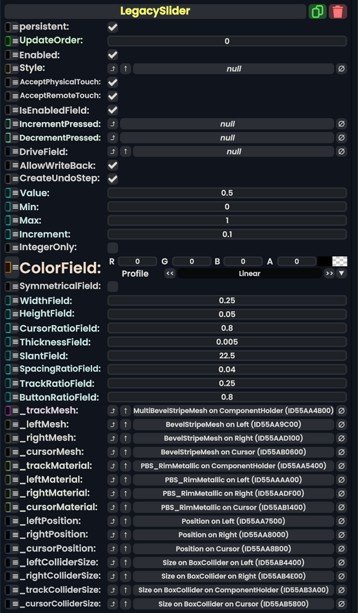
Legacy Slider component as seen in the Scene Inspector

The LegacySlider component was used in old legacy content to act as a UI for adjusting a float via a slider. This component should not be used in new content and should be replaced whenever possible.
Usage
| Name | Type | Description |
|---|---|---|
persistent
|
Bool | Determines whether or not this item will be saved to the server. |
UpdateOrder
|
Int | Controls the order in which this component is updated. |
Enabled
|
Bool | Controls whether or not this component is enabled. Some components stop their functionality when this field is disabled, but some don't. |
Style
|
direct RelayRef`1<LegacyUIStyle> | The source of the legacy color styles for this component. |
AcceptPhysicalTouch
|
Bool | Whether to allow Component:TipTouchSources to interact with/activate this component. |
AcceptRemoteTouch
|
Bool | Whether this component allows interaction via the user's interaction laser. |
IsEnabledField
|
Bool | Whether this Legacy UI element is enabled and usable. |
IncrementPressed
|
delegate of identity Action`1<LegacySlider> | The Sync delegate to call when the increment button is pressed, passing this component as an argument. |
DecrementPressed
|
delegate of identity Action`1<LegacySlider> | The Sync delegate to call when the decrement button is pressed, passing this component as an argument. |
DriveField
|
field drive of Float | The float field to drive with Value
|
AllowWriteBack
|
Bool | Whether changes to the value of the field targeted by DriveField should be written back to Value.
|
CreateUndoStep
|
Bool | Whether using this UI creates an Undo step. |
Value
|
Float | The value this component is influencing. |
Min
|
Float | The minimum value for Value.
|
Max
|
Float | The maximum value for Value.
|
Increment
|
Float | How much to shift Value by when using the slider side buttons.
|
IntegerOnly
|
Bool | Whether Value can only be a whole number.
|
ColorField
|
ColorX | The color of this UI. |
SymmetricalField
|
Bool | whether this UI should be symmetrical. |
WidthField
|
Float | The width of this UI. |
HeightField
|
Float | The height of this UI. |
CursorRatioField
|
Float | the size of the slider cursor compared to the slider container. |
ThicknessField
|
Float | the thickness of the UI. |
SlantField
|
Float | How beveled the UI is. |
SpacingRatioField
|
Float | How to space out the center UI and its buttons. |
TrackRatioField
|
Float | How big the slider track should be compared to the UI. |
ButtonRatioField
|
Float | How big the buttons should be compared to the slider. |
_trackMesh
|
reference drive of MultiBevelStripeMesh | The mesh for the slider track. |
_leftMesh
|
reference drive of BevelStripeMesh | The mesh for the left button. |
_rightMesh
|
reference drive of BevelStripeMesh | The mesh for the right button. |
_cursorMesh
|
reference drive of BevelStripeMesh | The mesh for the slider cursor. |
_trackMaterial
|
reference drive of PBS_RimMetallic | The material of the slider track. |
_leftMaterial
|
reference drive of PBS_RimMetallic | The material of the left button. |
_rightMaterial
|
reference drive of PBS_RimMetallic | The material of the right button. |
_cursorMaterial
|
reference drive of PBS_RimMetallic | The material of the slider cursor. |
_leftPosition
|
field drive of Float3 | The position field of the left button. |
_rightPosition
|
field drive of Float3 | The position field of the right button. |
_cursorPosition
|
field drive of Float3 | The position field of the cursor. |
_leftColliderSize
|
field drive of Float3 | The size field of the left button's collider. |
_rightColliderSize
|
field drive of Float3 | The size field of the right button's collider. |
_trackColliderSize
|
field drive of Float3 | The size field of the track's collider. |
_cursorColliderSize
|
field drive of Float3 | The size field of the cursor's collider. |
Sync Delegates
| Method Name | Method type and Arguments. | Is the method hidden? | Description |
|---|---|---|---|
LeftOnTouch:TouchEvent
|
TouchEvent | ✓ | Called when the left button is touched. |
RightOnTouch:TouchEvent
|
TouchEvent | ✓ | Called when the right button is touched. |
Usage
Just dont.
Examples
This article or section is a stub. You can help the Resonite wiki by expanding it.