(3 intermediate revisions by one other user not shown)
Line 1:
Line 1:
{{Infobox Component
{{Legacy}}{{Infobox Component
|Image=LegacySliderComponent.png
|Image=LegacySliderComponent.png
|Name=Legacy Slider
|Name=Legacy Slider
Line 20:
Line 20:
|Max|Float| The maximum value for <code>Value</code>.
|Max|Float| The maximum value for <code>Value</code>.
|Increment|Float| How much to shift <code>Value</code> by when using the slider side buttons.
|Increment|Float| How much to shift <code>Value</code> by when using the slider side buttons.
|IntegerOnly|Bool| Whether <code>Value</code> can only be a whole number.
|IntegerOnly|Bool| Whether <code>Value</code> can only be a whole number.
|ColorField|ColorX| The color of this UI.
|ColorField|ColorX| The color of this UI.
|SymmetricalField|Bool| whether this UI should be symmetrical.
|SymmetricalField|Bool| whether this UI should be symmetrical.
Line 36:
Line 36:
|_cursorMesh|{{RootFieldType|DriveRef`1|[[Component:BevelStripeMesh|BevelStripeMesh]]}}|TypeAdv27=true| The mesh for the slider cursor.
|_cursorMesh|{{RootFieldType|DriveRef`1|[[Component:BevelStripeMesh|BevelStripeMesh]]}}|TypeAdv27=true| The mesh for the slider cursor.
|_trackMaterial|{{RootFieldType|DriveRef`1|[[PBS_RimMetallic|PBS_RimMetallic]]}}|TypeAdv28=true| The material of the slider track.
|_trackMaterial|{{RootFieldType|DriveRef`1|[[PBS_RimMetallic|PBS_RimMetallic]]}}|TypeAdv28=true| The material of the slider track.
|_leftMaterial|{{RootFieldType|DriveRef`1|[[PBS_RimMetallic|PBS_RimMetallic]]}}|TypeAdv29=true| The material of the left button.
|_leftMaterial|{{RootFieldType|DriveRef`1|[[PBS_RimMetallic|PBS_RimMetallic]]}}|TypeAdv29=true| The material of the left button.
|_rightMaterial|{{RootFieldType|DriveRef`1|[[PBS_RimMetallic|PBS_RimMetallic]]}}|TypeAdv30=true| The material of the right button.
|_rightMaterial|{{RootFieldType|DriveRef`1|[[PBS_RimMetallic|PBS_RimMetallic]]}}|TypeAdv30=true| The material of the right button.
|_cursorMaterial|{{RootFieldType|DriveRef`1|[[PBS_RimMetallic|PBS_RimMetallic]]}}|TypeAdv31=true| The material of the slider cursor.
|_cursorMaterial|{{RootFieldType|DriveRef`1|[[PBS_RimMetallic|PBS_RimMetallic]]}}|TypeAdv31=true| The material of the slider cursor.
|_leftPosition|{{RootFieldType|FieldDrive`1|[[Type:Float3|Float3]]}}|TypeAdv32=true| The position field of the left button.
|_leftPosition|{{RootFieldType|FieldDrive`1|[[Type:Float3|Float3]]}}|TypeAdv32=true| The position field of the left button.
|_rightPosition|{{RootFieldType|FieldDrive`1|[[Type:Float3|Float3]]}}|TypeAdv33=true| The position field of the right button.
|_rightPosition|{{RootFieldType|FieldDrive`1|[[Type:Float3|Float3]]}}|TypeAdv33=true| The position field of the right button.
Line 46:
Line 46:
|_trackColliderSize|{{RootFieldType|FieldDrive`1|[[Type:Float3|Float3]]}}|TypeAdv37=true| The size field of the track's collider.
|_trackColliderSize|{{RootFieldType|FieldDrive`1|[[Type:Float3|Float3]]}}|TypeAdv37=true| The size field of the track's collider.
|_cursorColliderSize|{{RootFieldType|FieldDrive`1|[[Type:Float3|Float3]]}}|TypeAdv38=true| The size field of the cursor's collider.
|_cursorColliderSize|{{RootFieldType|FieldDrive`1|[[Type:Float3|Float3]]}}|TypeAdv38=true| The size field of the cursor's collider.
}}
== Sync Delegates ==
{{Table ComponentTriggers
|LeftOnTouch:[[Type:TouchEvent|TouchEvent]]|[[Type:TouchEvent|TouchEvent]]|true| Called when the left button is touched.
|RightOnTouch:[[Type:TouchEvent|TouchEvent]]|[[Type:TouchEvent|TouchEvent]]|true| Called when the right button is touched.
}}
}}
Latest revision as of 20:07, 7 April 2025
This article describes a feature marked as legacy—this usually means there's a newer, better alternative. Legacy features might not be removed but they will not be updated, and the team will not provide any support for them.
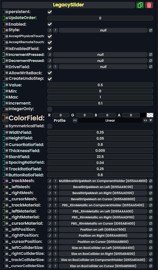
The LegacySlider component was used in old legacy content to act as a UI for adjusting a float via a slider. This component should not be used in new content and should be replaced whenever possible.