The '''RadiantModalOverlay''' component is similar to the [[Component:ModalOverlay|ModalOverlay]], but with the [[Context menu|radial menu]]. This also can be duplicated as a template in the [[Component:ModalOverlayManager|ModalOverlayManager]] component.
<!--T:3-->
<!--T:3-->
== Usage ==
== Fields ==
{{Table ComponentFields
{{Table ComponentFields
|ShowLerp|Float|
|ShowLerp|Float|The lerp amount for this modal.
|AnimationTime|Float|
|AnimationTime|Float|The lerp time for this modal.
|SizeRoot|RectTransform|
|SizeRoot|'''[[Component:RectTransform|RectTransform]]'''|TypeAdv2=true|The size of this modal.
|ContentRoot|RectTransform|
|ContentRoot|'''[[Component:RectTransform|RectTransform]]'''|TypeAdv3=true|The center root of this modal.
|CloseOnContextMenuAction|Bool|
|CloseOnContextMenuAction|Bool|Closes the modal when the user's context menu closes.
|BlurSpread|Float|
|CloseOnClick|Bool|Closes this modal when it is clicked on.
|BackgroundColor|Color|
|BlurSpread|Float|The blur effect amount.
|ContentAnimationScaleOffset|Float|
|BackgroundColor|ColorX|The background color of this RadiantModalOverlay.
|Padding|Float|
|ContentAnimationScaleOffset|Float|Offests the content animation for this RadiantModalOverlay.
|_blur|BlurMaterial|
|HeaderSize|Float|The header size of this RadiantModalOverlay.
|_blurGraphic|RawGraphic|
|Padding|Float|The padding amount for this RadiantModalOverlay.
|_blurSpread|Float2|
|_title|'''[[Component:Text|Text]]'''|TypeAdv11=true|The title of this RadiantModalOverlay.
|_backgroundColor|Color|
|_blur|'''[[BlurMaterial|BlurMaterial]]'''|TypeAdv12=true|The blur of this RadiantModalOverlay.
|_maskRect|Rect|
|_blurGraphic|'''[[Component:RawGraphic|RawGraphic]]'''|TypeAdv13=true|The blur graphic of this RadiantModalOverlay.
|_overlayAnchorMin|Float2|
|_blurSpread|{{RootFieldType|FieldDrive`1|[[Type:Float2|Float2]]}}|TypeAdv14=true|The blur speed of this RadiantModalOverlay.
|_overlayAnchorMax|Float2|
|_backgroundColor|{{RootFieldType|FieldDrive`1|[[Type:ColorX|ColorX]]}}|TypeAdv15=true|The background color of this RadiantModalOverlay.
|_contentOffsetMin|Float2|
|_maskRect|{{RootFieldType|FieldDrive`1|[[Type:Rect|Rect]]}}|TypeAdv16=true|The mask rect of this RadiantModalOverlay.
|_contentOffsetMax|Float2|
|_headerOffsetMin|{{RootFieldType|FieldDrive`1|[[Type:Float2|Float2]]}}|TypeAdv17=true|The header offset min of this RadiantModalOverlay.
|_headerOffsetMax|{{RootFieldType|FieldDrive`1|[[Type:Float2|Float2]]}}|TypeAdv18=true|The header offset max of this RadiantModalOverlay.
|_contentOffsetMin|{{RootFieldType|FieldDrive`1|[[Type:Float2|Float2]]}}|TypeAdv19=true|The content offset min of this RadiantModalOverlay.
|_contentOffsetMax|{{RootFieldType|FieldDrive`1|[[Type:Float2|Float2]]}}|TypeAdv20=true|The content offset max of this RadiantModalOverlay.
|_titleOffsetMin|{{RootFieldType|FieldDrive`1|[[Type:Float2|Float2]]}}|TypeAdv21=true|The title offset min of this RadiantModalOverlay.
|_titleOffsetMax|{{RootFieldType|FieldDrive`1|[[Type:Float2|Float2]]}}|TypeAdv22=true|The title offset max of this RadiantModalOverlay.
|_closeOffsetMin|{{RootFieldType|FieldDrive`1|[[Type:Float2|Float2]]}}|TypeAdv23=true|The close offset min of this RadiantModalOverlay.
|_closeOffsetMax|{{RootFieldType|FieldDrive`1|[[Type:Float2|Float2]]}}|TypeAdv24=true|The close offset max of this RadiantModalOverlay.
}}
== Sync Delegates ==
{{Table ComponentTriggers
|DoClose:[[Type:ButtonEventHandler|ButtonEventHandler]]|[[Type:ButtonEventHandler|ButtonEventHandler]]|true| Called when this UI is closed.
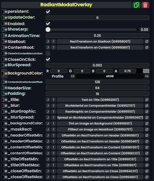
RadiantModalOverlay component as seen in the Scene Inspector
The RadiantModalOverlay component is similar to the ModalOverlay, but with the radial menu. This also can be duplicated as a template in the ModalOverlayManager component.