Automated: create new component page |
989onan bot (talk | contribs) Automated: Added {{Legacy}} |
||
| (One intermediate revision by one other user not shown) | |||
| Line 1: | Line 1: | ||
{{Infobox Component | {{Legacy}}{{Infobox Component | ||
|Image=LegacyProgressBarComponent.png | |Image=LegacyProgressBarComponent.png | ||
|Name=Legacy Progress Bar | |Name=Legacy Progress Bar | ||
}} | }} | ||
The '''LegacyProgressBar''' component was used in old progress bars for importing items or for cloud storage indicators. This should not be used for new content and should be removed when possible. | |||
== | == Fields == | ||
{{Table ComponentFields | {{Table ComponentFields | ||
|Style|{{RootFieldType|RelayRef`1|[[Component:LegacyUIStyle|LegacyUIStyle]]}}|TypeAdv0=true| | |Style|{{RootFieldType|RelayRef`1|[[Component:LegacyUIStyle|LegacyUIStyle]]}}|TypeAdv0=true| {{Template:LegacyUI_Style}} | ||
|AcceptPhysicalTouch|Bool| | |AcceptPhysicalTouch|Bool| {{Template:Touchable_AcceptPhysicalTouch}} | ||
|AcceptRemoteTouch|Bool| | |AcceptRemoteTouch|Bool| {{Template:Touchable_AcceptRemoteTouch}} | ||
|IsEnabledField|Bool| | |IsEnabledField|Bool| {{Template:LegacyUI_IsEnabled}} | ||
|Progress|Float| | |Progress|Float| How close the item is to being imported. | ||
|BarColorField|ColorX| | |BarColorField|ColorX| The color of the loading bar. | ||
|ContainerColorField|ColorX| | |ContainerColorField|ColorX| The color of the container of the loading bar. | ||
|WidthField|Float| | |WidthField|Float| The width of the UI. | ||
|HeightField|Float| | |HeightField|Float| The height of the UI. | ||
|ThicknessField|Float| | |ThicknessField|Float| The thickness of the UI. | ||
|SlantField|Float| | |SlantField|Float| How beveled the UI edges are. | ||
|_barMesh|{{RootFieldType|DriveRef`1|[[Component:BevelStripeMesh|BevelStripeMesh]]}}|TypeAdv11=true| | |_barMesh|{{RootFieldType|DriveRef`1|[[Component:BevelStripeMesh|BevelStripeMesh]]}}|TypeAdv11=true| The mesh used for the progress bar. | ||
|_containerMesh|{{RootFieldType|DriveRef`1|[[Component:BevelStripeMesh|BevelStripeMesh]]}}|TypeAdv12=true| | |_containerMesh|{{RootFieldType|DriveRef`1|[[Component:BevelStripeMesh|BevelStripeMesh]]}}|TypeAdv12=true| The mesh used for the UI container. | ||
|_barMaterial|{{RootFieldType|DriveRef`1|[[PBS_RimMetallic|PBS_RimMetallic]]}}|TypeAdv13=true| | |_barMaterial|{{RootFieldType|DriveRef`1|[[PBS_RimMetallic|PBS_RimMetallic]]}}|TypeAdv13=true| The material used for the progress bar. | ||
|_containerMaterial|{{RootFieldType|DriveRef`1|[[PBS_RimMetallic|PBS_RimMetallic]]}}|TypeAdv14=true| | |_containerMaterial|{{RootFieldType|DriveRef`1|[[PBS_RimMetallic|PBS_RimMetallic]]}}|TypeAdv14=true| The material used for the UI container. | ||
|_barPosition|{{RootFieldType|FieldDrive`1|[[Type:Float3|Float3]]}}|TypeAdv15=true| | |_barPosition|{{RootFieldType|FieldDrive`1|[[Type:Float3|Float3]]}}|TypeAdv15=true| The position field of the bar. | ||
|_colliderSize|{{RootFieldType|FieldDrive`1|[[Type:Float3|Float3]]}}|TypeAdv16=true| | |_colliderSize|{{RootFieldType|FieldDrive`1|[[Type:Float3|Float3]]}}|TypeAdv16=true| The field of the collider size for the UI. | ||
}} | }} | ||
== | == Usage == | ||
Just dont. | |||
== Examples == | == Examples == | ||
{{stub}} | |||
== See Also == | == See Also == | ||
| Line 34: | Line 36: | ||
[[Category:Components:UI:Physical{{#translation:}}|Legacy Progress Bar]] | [[Category:Components:UI:Physical{{#translation:}}|Legacy Progress Bar]] | ||
[[Category:Components{{#translation:}}|Legacy Progress Bar]] | [[Category:Components{{#translation:}}|Legacy Progress Bar]] | ||
Latest revision as of 03:44, 7 April 2025
Component image 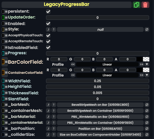
Legacy Progress Bar component as seen in the Scene Inspector

The LegacyProgressBar component was used in old progress bars for importing items or for cloud storage indicators. This should not be used for new content and should be removed when possible.
Fields
| Name | Type | Description |
|---|---|---|
persistent
|
Bool | Determines whether or not this item will be saved to the server. |
UpdateOrder
|
Int | Controls the order in which this component is updated. |
Enabled
|
Bool | Controls whether or not this component is enabled. Some components stop their functionality when this field is disabled, but some don't. |
Style
|
direct RelayRef`1<LegacyUIStyle> | The source of the legacy color styles for this component. |
AcceptPhysicalTouch
|
Bool | Whether to allow Component:TipTouchSources to interact with/activate this component. |
AcceptRemoteTouch
|
Bool | Whether this component allows interaction via the user's interaction laser. |
IsEnabledField
|
Bool | Whether this Legacy UI element is enabled and usable. |
Progress
|
Float | How close the item is to being imported. |
BarColorField
|
ColorX | The color of the loading bar. |
ContainerColorField
|
ColorX | The color of the container of the loading bar. |
WidthField
|
Float | The width of the UI. |
HeightField
|
Float | The height of the UI. |
ThicknessField
|
Float | The thickness of the UI. |
SlantField
|
Float | How beveled the UI edges are. |
_barMesh
|
reference drive of BevelStripeMesh | The mesh used for the progress bar. |
_containerMesh
|
reference drive of BevelStripeMesh | The mesh used for the UI container. |
_barMaterial
|
reference drive of PBS_RimMetallic | The material used for the progress bar. |
_containerMaterial
|
reference drive of PBS_RimMetallic | The material used for the UI container. |
_barPosition
|
field drive of Float3 | The position field of the bar. |
_colliderSize
|
field drive of Float3 | The field of the collider size for the UI. |
Usage
Just dont.
Examples
This article or section is a stub. You can help the Resonite wiki by expanding it.