Added a video section. Added old platform's videos for UIX tutorials. |
Updated tutorial. Added a picture link. |
||
| (3 intermediate revisions by the same user not shown) | |||
| Line 5: | Line 5: | ||
=== Empty canvas === <!--T:18--> | === Empty canvas === <!--T:18--> | ||
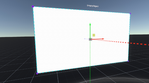
[[File:MakeCanvasFromScratchExample.png|alt=A newly created canvas from scratch.|thumb|A newly created canvas from scratch.]] | |||
<!--T:19--> | <!--T:19--> | ||
# Using the [[Developer Tool]], Create New > Empty Object. | # Using the [[Developer Tool]], [[Create New Wizard|Create New]] > Empty Object. | ||
# In that object, Attach Component > UIX > [[Canvas]]. | # In that object, Attach Component > [[UIX]] > [[Canvas]]. | ||
# Change the Scale of the object to 0.001 on all axes to get the object to be a more reasonable size. | # Change the Scale of the object to 0.001 on all axes to get the object to be a more reasonable size. | ||
# You can then change the Canvas's Size x and y (in pixels) to your liking. | # You can then change the Canvas's Size x and y (in pixels) to your liking. | ||
# Next, on the same empty object, Attach Component > UIX > Graphics > [[Image (Component)|Image]]. You can change the image's Tint to change the base color of the canvas. | # Next, on the same empty object, Attach Component > [[UIX]] > [[:Category:Components:UIX:Graphics|Graphics]] > [[Image (Component)|Image]]. You can change the image's Tint to change the base color of the canvas. | ||
# Again using the [[Developer Tool]], Create New > Materials > UI > UI Unlit. | # Again using the [[Developer Tool]], Create New > [[Materials]] > UI > [[Component:UI_UnlitMaterial|UI Unlit]]. | ||
# Change the material's ZWrite property to On, and the OffsetFactor and OffsetUnits properties to 1. | # Change the material's ZWrite property to On, and the OffsetFactor and OffsetUnits properties to 1. | ||
# Grab the material ball and click on your empty object's Image Material slot to load it in. This fixes the "bleed-through" effect which would cause different UIX objects to bleed through each other if placed on top of each other. | # Grab the material ball and click on your empty object's Image Material slot to load it in. This fixes the "bleed-through" effect which would cause different [[UIX]] objects to bleed through each other if placed on top of each other. | ||
# You may also want to make the canvas grabbable (Attach Component > Transform > Interaction > [[Grabbable (Component)|Grabbable]]). | # You may also want to make the canvas grabbable (Attach Component > Transform > Interaction > [[Grabbable (Component)|Grabbable]]). | ||
| Line 26: | Line 27: | ||
=== A button === <!--T:22--> | === A button === <!--T:22--> | ||
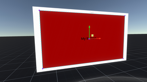
[[File:MakeButtonFromScratchExample.png|alt=A newly created button from scratch.|thumb|A newly created button from scratch.]] | |||
<!--T:23--> | <!--T:23--> | ||
# Add a child to your canvas (or layout | # Add a child to your canvas (or layout) and call it "Button". | ||
# In that object, Attach Component > UIX > Graphics > [[Image (Component)|Image]]. You can change the image's Tint to change the base color of the button. | # In that object, Attach Component > [[UIX]] > [[:Category:Components:UIX:Graphics|Graphics]] > [[Image (Component)|Image]]. You can change the image's Tint to change the base color of the button. | ||
# Change the RectTransform's AnchorMin/Max to add a border around the button. This effectively tells the parent where the child is and how to scale it. | # Change the [[Component:RectTransform|RectTransform's]] AnchorMin/Max to add a border around the button. This effectively tells the parent where the child is and how to scale it. | ||
#* AnchorMin (x,y) is the lower left corner of a rectangle on the parent canvas that the child should be fit into, ranging from 0 to 1. (0,0) is the lower left of the parent. | #* AnchorMin (x,y) is the lower left corner of a rectangle on the parent canvas that the child should be fit into, ranging from 0 to 1. (0,0) is the lower left of the parent. | ||
#* AnchorMax (x,y) is the upper right corner of a rectangle on the parent canvas that the child should be fit into, ranging from 0 to 1. (1,1) is the upper right of the parent. | #* AnchorMax (x,y) is the upper right corner of a rectangle on the parent canvas that the child should be fit into, ranging from 0 to 1. (1,1) is the upper right of the parent. | ||
#* Adding a small border of, say, 5% of the parent's size, means the AnchorMin should be (0.05,0.05) (i.e. 0,0 plus 5%) and AnchorMax should be (0.95,0.95) (i.e. 1,1 minus 5%). | #* Adding a small border of, say, 5% of the parent's size, means the AnchorMin should be (0.05,0.05) (i.e. 0,0 plus 5%) and AnchorMax should be (0.95,0.95) (i.e. 1,1 minus 5%). | ||
# Attach Component > UIX > Interaction > [[Button (Component)|Button]]. Based on the image's Tint, the button will automatically fill out the colors for its normal, highlight, press, and disabled states. | # Attach Component > [[UIX]] > Interaction > [[Button (Component)|Button]]. Based on the image's Tint, the button will automatically fill out the colors for its <code>normal</code>, <code>highlight</code>, <code>press</code>, and <code>disabled</code> states. | ||
# You may add text to the button: | # You may add text to the button: | ||
## Create a child object of the button and call it Text. | ## Create a child object of the button and call it "Text". | ||
## On that child, Attach Component > UIX > Graphics > [[Text (Component)|Text]]. | ## On that child, Attach Component > [[UIX]] > Graphics > [[Text (Component)|Text]]. | ||
## Change the text to what you want. | ## Change the text to what you want. | ||
## Alter the font size, set up autosize, change the alignment to what you want. | ## Alter the font size, set up autosize, change the alignment to what you want. | ||
| Line 58: | Line 60: | ||
=== Scrollable text === <!--T:27--> | === Scrollable text === <!--T:27--> | ||
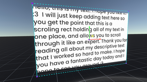
[[File:MakeScrollTextFromScratchExample.png|alt=A newly created scrolling text from scratch.|thumb|A newly created scrolling text from scratch.]] | |||
<!--T:28--> | <!--T:28--> | ||
# Add a child to your canvas (or layout | # Add a child to your canvas (or layout) and call it "Mask". | ||
# In that object, Attach Component > UIX > [[Mask (Component)|Mask]]. This effectively makes any graphical elements from children that wander outside the RectTransform invisible. | # In that object, Attach Component > [[UIX]] > [[:Category:Components:UIX:Graphics|Graphics]] > [[Mask (Component)|Mask]]. This effectively makes any graphical elements from children that wander outside the [[Component:RectTransform|RectTransform]] invisible. | ||
# In the same object, Attach Component > UIX > Graphics > [[Image (Component)|Image]]. | # In the same object, Attach Component > [[UIX]] > [[:Category:Components:UIX:Graphics|Graphics]] > [[Image (Component)|Image]]. | ||
# Turn on the Mask's ShowMaskGraphic property. | # Turn on the Mask's <code>ShowMaskGraphic</code> property. | ||
# Add a child to the Mask object and call it ScrollRect. | # Add a child to the Mask object and call it "ScrollRect". | ||
# In that object, Attach Component > UIX > Interaction > [[ScrollRect (Component)|ScrollRect]]. | # In that object, Attach Component > [[UIX]] > Interaction > [[ScrollRect (Component)|ScrollRect]]. | ||
# In the same object, Attach Component > UIX > Layout > [[ContentSizeFitter (Component)|ContentSizeFitter]]. | # In the same object, Attach Component > [[UIX]] > Layout > [[ContentSizeFitter (Component)|ContentSizeFitter]]. | ||
# Set the ContentSizeFitter's VerticalFit property to MinSize. | # Set the ContentSizeFitter's <code>VerticalFit</code> property to <code>MinSize</code>. | ||
# In the same object, Attach Component > UIX > Layout > [[VerticalLayout (Component)|VerticalLayout]]. | # In the same object, Attach Component > [[UIX]] > Layout > [[VerticalLayout (Component)|VerticalLayout]]. | ||
# Add a child to the ScrollRect object and call it Content. | # Add a child to the ScrollRect object and call it "Content". | ||
# In that object, Attach Component > UIX > Graphics > [[Text (Component)|Text]]. | # In that object, Attach Component > [[UIX]] > Graphics > [[Text (Component)|Text]]. | ||
# Change the text to what you want. Typically for long text that you get from a file, you would import a text file from your computer, inspect the result, navigate to the text component (object > ScrollRect > Content), and grab and drag the Text component's Content property into your object's Text Content. | # Change the text to what you want. Typically for long text that you get from a file, you would import a text file from your computer, inspect the result, navigate to the text component (object > ScrollRect > Content), and grab and drag the Text component's Content property into your object's Text Content. | ||
# Alter the font size, set up autosize, change the alignment to what you want. | # Alter the font size, set up autosize, change the alignment to what you want. | ||
| Line 78: | Line 81: | ||
=== A simple vertical layout === <!--T:29--> | === A simple vertical layout === <!--T:29--> | ||
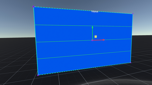
[[File:MakeVerticalLayoutFromScratchExample.png|alt=A newly created vertical layout from scratch.|thumb|A newly created vertical layout from scratch.]] | |||
<!--T:30--> | <!--T:30--> | ||
# Add a child to your canvas (or layout | # Add a child to your canvas (or layout) and call it "Layout". | ||
# In that object, Attach Component > UIX > Graphics > [[Image (Component)|Image]]. Set the Tint to something that will differentiate this object from child objects. | # In that object, Attach Component > [[UIX]] > [[:Category:Components:UIX:Graphics|Graphics]] > [[Image (Component)|Image]]. Set the Tint to something that will differentiate this object from child objects. | ||
# Also in that object, Attach Component > UIX > Layout > [[VerticalLayout (Component)|VerticalLayout]]. | # Also in that object, Attach Component > [[UIX]] > Layout > [[VerticalLayout (Component)|VerticalLayout]]. | ||
# Change all the Padding and the Spacing properties on the VerticalLayout to 4. | # Change all the Padding and the Spacing properties on the VerticalLayout to <code>4</code>. | ||
# Add a child of Layout, and call it Element. | # Add a child of Layout, and call it "Element". | ||
# In that object, Attach Component > UIX > Graphics > [[Image (Component)|Image]]. Set the Tint to something that will differentiate this object from the layout object. | # In that object, Attach Component > [[UIX]] > Graphics > [[Image (Component)|Image]]. Set the Tint to something that will differentiate this object from the layout object. | ||
# Duplicate this object a few times. They will all be children of Layout. | # Duplicate this object a few times. They will all be children of Layout. | ||
# You may need to heed the warning | # You may need to heed the [[UIX#Layouts|warning about layouts]], and duplicate the canvas to get the layout to recalculate if needed. | ||
# You can add [[LayoutElement (Component)|LayoutElement]] to each Element. This tells the parent layout how to calculate widths and heights. | # You can add [[LayoutElement (Component)|LayoutElement]] to each Element. This tells the parent layout how to calculate widths and heights. | ||
Latest revision as of 01:14, 21 July 2024
This article or section is a stub. You can help the Resonite wiki by expanding it.
This page is dedicated to tutorials of putting together UIX, using the provided components in UIX Category.
Tutorials
Empty canvas

- Using the Developer Tool, Create New > Empty Object.
- In that object, Attach Component > UIX > Canvas.
- Change the Scale of the object to 0.001 on all axes to get the object to be a more reasonable size.
- You can then change the Canvas's Size x and y (in pixels) to your liking.
- Next, on the same empty object, Attach Component > UIX > Graphics > Image. You can change the image's Tint to change the base color of the canvas.
- Again using the Developer Tool, Create New > Materials > UI > UI Unlit.
- Change the material's ZWrite property to On, and the OffsetFactor and OffsetUnits properties to 1.
- Grab the material ball and click on your empty object's Image Material slot to load it in. This fixes the "bleed-through" effect which would cause different UIX objects to bleed through each other if placed on top of each other.
- You may also want to make the canvas grabbable (Attach Component > Transform > Interaction > Grabbable).
You can now add children to be displayed on the canvas.
ProbablePrime's public folder, under Tutorials > UIX, contains a CanvasTemplate which has already done all the above steps for you. Simply spawn one out and start from there.
A button

- Add a child to your canvas (or layout) and call it "Button".
- In that object, Attach Component > UIX > Graphics > Image. You can change the image's Tint to change the base color of the button.
- Change the RectTransform's AnchorMin/Max to add a border around the button. This effectively tells the parent where the child is and how to scale it.
- AnchorMin (x,y) is the lower left corner of a rectangle on the parent canvas that the child should be fit into, ranging from 0 to 1. (0,0) is the lower left of the parent.
- AnchorMax (x,y) is the upper right corner of a rectangle on the parent canvas that the child should be fit into, ranging from 0 to 1. (1,1) is the upper right of the parent.
- Adding a small border of, say, 5% of the parent's size, means the AnchorMin should be (0.05,0.05) (i.e. 0,0 plus 5%) and AnchorMax should be (0.95,0.95) (i.e. 1,1 minus 5%).
- Attach Component > UIX > Interaction > Button. Based on the image's Tint, the button will automatically fill out the colors for its
normal,highlight,press, anddisabledstates. - You may add text to the button:
- You can hook the button up to ProtoFlux by creating a Button Events node, grabbing a reference to the Button component from the inspector, and dropping it into the reference field on the Button Events node.
You can also put an icon on a button.
- On the Button object, Attach Component > Assets > SpriteProvider.
- Drop your chosen image into the Texture property of the SpriteProvider.
- Grab the SpriteProvider and drop it into the Sprite property of the Button's Image.
- Use the Tint property on the Image to color the icon.
- You can parent the Button to another object with an Image to set the background.
ProbablePrime's public folder, under UI Stuff > Icons > Shapes, has many icons for your use.
Scrollable text

- Add a child to your canvas (or layout) and call it "Mask".
- In that object, Attach Component > UIX > Graphics > Mask. This effectively makes any graphical elements from children that wander outside the RectTransform invisible.
- In the same object, Attach Component > UIX > Graphics > Image.
- Turn on the Mask's
ShowMaskGraphicproperty. - Add a child to the Mask object and call it "ScrollRect".
- In that object, Attach Component > UIX > Interaction > ScrollRect.
- In the same object, Attach Component > UIX > Layout > ContentSizeFitter.
- Set the ContentSizeFitter's
VerticalFitproperty toMinSize. - In the same object, Attach Component > UIX > Layout > VerticalLayout.
- Add a child to the ScrollRect object and call it "Content".
- In that object, Attach Component > UIX > Graphics > Text.
- Change the text to what you want. Typically for long text that you get from a file, you would import a text file from your computer, inspect the result, navigate to the text component (object > ScrollRect > Content), and grab and drag the Text component's Content property into your object's Text Content.
- Alter the font size, set up autosize, change the alignment to what you want.
- Change the font color to something that will show up against the mask image color!
A simple vertical layout

- Add a child to your canvas (or layout) and call it "Layout".
- In that object, Attach Component > UIX > Graphics > Image. Set the Tint to something that will differentiate this object from child objects.
- Also in that object, Attach Component > UIX > Layout > VerticalLayout.
- Change all the Padding and the Spacing properties on the VerticalLayout to
4. - Add a child of Layout, and call it "Element".
- In that object, Attach Component > UIX > Graphics > Image. Set the Tint to something that will differentiate this object from the layout object.
- Duplicate this object a few times. They will all be children of Layout.
- You may need to heed the warning about layouts, and duplicate the canvas to get the layout to recalculate if needed.
- You can add LayoutElement to each Element. This tells the parent layout how to calculate widths and heights.
Examples
Videos
The following videos are ProbablePrime's videos explaining UIX piece by piece.