The '''TouchButton''' component is used to make a physical button with no press depth that is instantly pressable upon click or touch. For a button with press depth, please see [[Component:PhysicalButton|PhysicalButton]].
<!--T:2-->
<!--T:2-->
== Fields ==
== Fields ==
{{Table ComponentFields
{{Table ComponentFields
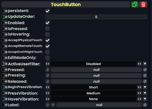
|IsPressed|Bool|
|IsPressed|Bool| Whether the button is pressed or not
|IsHovering|Bool|
|IsHovering|Bool| Whether the button is being pointed at with the laser in the case of a touch button
|AcceptPhysicalTouch|Bool|
|AcceptPhysicalTouch|Bool| Whether the button accepts input from [[Component:TipTouchSource|Tip Touch Sources]]
|AcceptRemoteTouch|Bool|
|AcceptRemoteTouch|Bool| Whether the button accepts input via laser
|AcceptOutOfSightTouch|Bool|
|AcceptOutOfSightTouch|Bool| Whether the button accepts input when it is outside the interacting user's view.
|EditModeOnly|Bool|
|EditModeOnly|Bool| Whether this button will only work if the user is in [[Edit Mode]]
|ActiveUserFilter|ActiveUserHandling|
|ActiveUserFilter|ActiveUserHandling| How to handle user interaction depending on active user.
|Pressed|{{RootFieldType|SyncDelegate`1|[[Type:ButtonEventHandler|ButtonEventHandler]]}}|TypeAdv7=true| The [[Sync Delegate]] to call when the button is pressed.
|Pressing|{{RootFieldType|SyncDelegate`1|[[Type:ButtonEventHandler|ButtonEventHandler]]}}|TypeAdv8=true| The [[Sync Delegate]] to call when the button is being pressed every game tick.
|Released|{{RootFieldType|SyncDelegate`1|[[Type:ButtonEventHandler|ButtonEventHandler]]}}|TypeAdv9=true| The [[Sync Delegate]] to call when the button is released.
|BeginPressVibration|VibratePreset|
|BeginPressVibration|VibratePreset| What vibration to send when this button is starting to be pressed.
|PressVibration|VibratePreset|
|PressVibration|VibratePreset| What vibration to send when this button is pressed.
|HoverVibration|VibratePreset|
|HoverVibration|VibratePreset| What vibration to send when this button is hovered over via laser.
|Label|'''[[Type:IField`1|IField`1]]<[[Type:String|String]]>'''|TypeAdv13=true| The field that represents this button's label.
}}
}}
<!--T:3-->
<!--T:3-->
== Usage ==
== Usage ==
Used in boopers and buttons where [[Component:PhysicalButton|PhysicalButton]] is a bad choice because the button press needs to have no press depth. In the case where the user does want press depth, use [[Component:PhysicalButton|PhysicalButton]].
<!--T:4-->
<!--T:4-->
== Examples ==
== Examples ==
{{stub}}
<!--T:5-->
<!--T:5-->
== Related Components ==
== See Also ==
* [[Type:IButton|IButton]] For a list of button types.
The TouchButton component is used to make a physical button with no press depth that is instantly pressable upon click or touch. For a button with press depth, please see PhysicalButton.
Used in boopers and buttons where PhysicalButton is a bad choice because the button press needs to have no press depth. In the case where the user does want press depth, use PhysicalButton.
Examples
This article or section is a stub. You can help the Resonite wiki by expanding it.