Component:LegacyTextField: Difference between revisions
From Resonite Wiki
More actions
Automated: create new component page |
add info |
||
| Line 3: | Line 3: | ||
|Name=Legacy Text Field | |Name=Legacy Text Field | ||
}} | }} | ||
The '''LegacyTextField''' component was used to edit text in old content migrated from other platforms. This component should not be used in new content, and should be replaced whenever possible. | |||
== | == Fields == | ||
{{Table ComponentFields | {{Table ComponentFields | ||
|Style|{{RootFieldType|RelayRef`1|[[Component:LegacyUIStyle|LegacyUIStyle]]}}|TypeAdv0=true| | |Style|{{RootFieldType|RelayRef`1|[[Component:LegacyUIStyle|LegacyUIStyle]]}}|TypeAdv0=true| {{Template:LegacyUI_Style}} | ||
|AcceptPhysicalTouch|Bool| | |AcceptPhysicalTouch|Bool| {{Template:Touchable_AcceptPhysicalTouch}} | ||
|AcceptRemoteTouch|Bool| | |AcceptRemoteTouch|Bool| {{Template:Touchable_AcceptRemoteTouch}} | ||
|Color|ColorX| | |Color|ColorX| The color of the UI elements. | ||
|Width|Float| | |Width|Float| The width of the UI. | ||
|Height|Float| | |Height|Float| The height of the UI. | ||
|Thickness|Float| | |Thickness|Float| The thickness of the UI. | ||
|Slant|Float| | |Slant|Float| How beveled the UI elements should be. | ||
|_textSlot|Slot| | |_textSlot|Slot| The slot of the text visual of this UI element. | ||
|_textRenderer|'''[[Component:TextRenderer|TextRenderer]]'''|TypeAdv9=true| | |_textRenderer|'''[[Component:TextRenderer|TextRenderer]]'''|TypeAdv9=true| The text renderer of this UI element. | ||
|_textEditor|'''[[Component:TextEditor|TextEditor]]'''|TypeAdv10=true| | |_textEditor|'''[[Component:TextEditor|TextEditor]]'''|TypeAdv10=true| The text editor that allows direct editing of the value this UI element controls. | ||
|_material|{{RootFieldType|DriveRef`1|[[PBS_RimMetallic|PBS_RimMetallic]]}}|TypeAdv11=true| | |_material|{{RootFieldType|DriveRef`1|[[PBS_RimMetallic|PBS_RimMetallic]]}}|TypeAdv11=true| The material of this UI. | ||
|_mesh|{{RootFieldType|DriveRef`1|[[Component:BevelStripeMesh|BevelStripeMesh]]}}|TypeAdv12=true| | |_mesh|{{RootFieldType|DriveRef`1|[[Component:BevelStripeMesh|BevelStripeMesh]]}}|TypeAdv12=true| The mesh of this UI. | ||
|_textBounds|{{RootFieldType|FieldDrive`1|[[Type:Float2|Float2]]}}|TypeAdv13=true| | |_textBounds|{{RootFieldType|FieldDrive`1|[[Type:Float2|Float2]]}}|TypeAdv13=true| The field to drive with the bounds of the text to keep the UI around it. | ||
|_colliderSize|{{RootFieldType|FieldDrive`1|[[Type:Float3|Float3]]}}|TypeAdv14=true| | |_colliderSize|{{RootFieldType|FieldDrive`1|[[Type:Float3|Float3]]}}|TypeAdv14=true| The field to drive with what the size of this UI's collider should be. | ||
|_meshLeft|{{RootFieldType|DriveRef`1|[[Component:BevelStripeMesh|BevelStripeMesh]]}}|TypeAdv15=true| | |_meshLeft|{{RootFieldType|DriveRef`1|[[Component:BevelStripeMesh|BevelStripeMesh]]}}|TypeAdv15=true| The mesh of the left button. | ||
|_meshRight|{{RootFieldType|DriveRef`1|[[Component:BevelStripeMesh|BevelStripeMesh]]}}|TypeAdv16=true| | |_meshRight|{{RootFieldType|DriveRef`1|[[Component:BevelStripeMesh|BevelStripeMesh]]}}|TypeAdv16=true| The mesh of the right button. | ||
|_textLeftBounds|{{RootFieldType|FieldDrive`1|[[Type:Float2|Float2]]}}|TypeAdv17=true| | |_textLeftBounds|{{RootFieldType|FieldDrive`1|[[Type:Float2|Float2]]}}|TypeAdv17=true| The field to drive with the bounds of the text on the left button so the UI stays wrapped around it. | ||
|_textRightBounds|{{RootFieldType|FieldDrive`1|[[Type:Float2|Float2]]}}|TypeAdv18=true| | |_textRightBounds|{{RootFieldType|FieldDrive`1|[[Type:Float2|Float2]]}}|TypeAdv18=true| The field to drive with the bounds of the text on the right button so the UI stays wrapped around it. | ||
|_leftTextRenderer|'''[[Component:TextRenderer|TextRenderer]]'''|TypeAdv19=true| | |_leftTextRenderer|'''[[Component:TextRenderer|TextRenderer]]'''|TypeAdv19=true| The text renderer of the left button. | ||
|_rightTextRenderer|'''[[Component:TextRenderer|TextRenderer]]'''|TypeAdv20=true| | |_rightTextRenderer|'''[[Component:TextRenderer|TextRenderer]]'''|TypeAdv20=true| The text renderer of the right button. | ||
|_colliderLeftSize|{{RootFieldType|FieldDrive`1|[[Type:Float3|Float3]]}}|TypeAdv21=true| | |_colliderLeftSize|{{RootFieldType|FieldDrive`1|[[Type:Float3|Float3]]}}|TypeAdv21=true| The field to drive with what the size of the left collider should be. | ||
|_colliderRightSize|{{RootFieldType|FieldDrive`1|[[Type:Float3|Float3]]}}|TypeAdv22=true| | |_colliderRightSize|{{RootFieldType|FieldDrive`1|[[Type:Float3|Float3]]}}|TypeAdv22=true| The field to drive with what the size of the right collider should be. | ||
|_leftOffset|{{RootFieldType|FieldDrive`1|[[Type:Float3|Float3]]}}|TypeAdv23=true| | |_leftOffset|{{RootFieldType|FieldDrive`1|[[Type:Float3|Float3]]}}|TypeAdv23=true| The field to drive with what the offset of the left collider should be. | ||
|_rightOffset|{{RootFieldType|FieldDrive`1|[[Type:Float3|Float3]]}}|TypeAdv24=true| | |_rightOffset|{{RootFieldType|FieldDrive`1|[[Type:Float3|Float3]]}}|TypeAdv24=true| The field to drive with what the offset of the right collider should be. | ||
|_leftTextPosition|{{RootFieldType|FieldDrive`1|[[Type:Float3|Float3]]}}|TypeAdv25=true| | |_leftTextPosition|{{RootFieldType|FieldDrive`1|[[Type:Float3|Float3]]}}|TypeAdv25=true| The field to drive wiyh what the position of the text on the left button should be. | ||
|_rightTextPosition|{{RootFieldType|FieldDrive`1|[[Type:Float3|Float3]]}}|TypeAdv26=true| | |_rightTextPosition|{{RootFieldType|FieldDrive`1|[[Type:Float3|Float3]]}}|TypeAdv26=true| The field to drive wiyh what the position of the text on the right button should be. | ||
|IsEnabled|Bool| | |IsEnabled|Bool| {{Template:LegacyUI_IsEnabled}} | ||
|_hintTextRenderer|'''[[Component:TextRenderer|TextRenderer]]'''|TypeAdv28=true| | |_hintTextRenderer|'''[[Component:TextRenderer|TextRenderer]]'''|TypeAdv28=true| the text renderer of the edit text hint | ||
|_hintTextBounds|{{RootFieldType|FieldDrive`1|[[Type:Float2|Float2]]}}|TypeAdv29=true| | |_hintTextBounds|{{RootFieldType|FieldDrive`1|[[Type:Float2|Float2]]}}|TypeAdv29=true| the field to drive with the bounds of the hint text for keeping a UI wrapped around it. | ||
|_hintTextEnabled|{{RootFieldType|FieldDrive`1|[[Type:Bool|Bool]]}}|TypeAdv30=true| | |_hintTextEnabled|{{RootFieldType|FieldDrive`1|[[Type:Bool|Bool]]}}|TypeAdv30=true| Whether the hint text should be enabled or not. | ||
}} | }} | ||
== | == Usage == | ||
Just dont. | |||
== Examples == | == Examples == | ||
{{stub}} | |||
== See Also == | == See Also == | ||
| Line 48: | Line 50: | ||
[[Category:Components:UI:Physical{{#translation:}}|Legacy Text Field]] | [[Category:Components:UI:Physical{{#translation:}}|Legacy Text Field]] | ||
[[Category:Components{{#translation:}}|Legacy Text Field]] | [[Category:Components{{#translation:}}|Legacy Text Field]] | ||
Revision as of 19:57, 21 January 2025
Component image 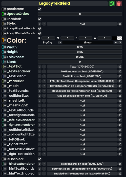
Legacy Text Field component as seen in the Scene Inspector

The LegacyTextField component was used to edit text in old content migrated from other platforms. This component should not be used in new content, and should be replaced whenever possible.
Fields
| Name | Type | Description |
|---|---|---|
persistent
|
Bool | Determines whether or not this item will be saved to the server. |
UpdateOrder
|
Int | Controls the order in which this component is updated. |
Enabled
|
Bool | Controls whether or not this component is enabled. Some components stop their functionality when this field is disabled, but some don't. |
Style
|
direct RelayRef`1<LegacyUIStyle> | The source of the legacy color styles for this component. |
AcceptPhysicalTouch
|
Bool | Whether to allow Component:TipTouchSources to interact with/activate this component. |
AcceptRemoteTouch
|
Bool | Whether this component allows interaction via the user's interaction laser. |
Color
|
ColorX | The color of the UI elements. |
Width
|
Float | The width of the UI. |
Height
|
Float | The height of the UI. |
Thickness
|
Float | The thickness of the UI. |
Slant
|
Float | How beveled the UI elements should be. |
_textSlot
|
Slot | The slot of the text visual of this UI element. |
_textRenderer
|
TextRenderer | The text renderer of this UI element. |
_textEditor
|
TextEditor | The text editor that allows direct editing of the value this UI element controls. |
_material
|
reference drive of PBS_RimMetallic | The material of this UI. |
_mesh
|
reference drive of BevelStripeMesh | The mesh of this UI. |
_textBounds
|
field drive of Float2 | The field to drive with the bounds of the text to keep the UI around it. |
_colliderSize
|
field drive of Float3 | The field to drive with what the size of this UI's collider should be. |
_meshLeft
|
reference drive of BevelStripeMesh | The mesh of the left button. |
_meshRight
|
reference drive of BevelStripeMesh | The mesh of the right button. |
_textLeftBounds
|
field drive of Float2 | The field to drive with the bounds of the text on the left button so the UI stays wrapped around it. |
_textRightBounds
|
field drive of Float2 | The field to drive with the bounds of the text on the right button so the UI stays wrapped around it. |
_leftTextRenderer
|
TextRenderer | The text renderer of the left button. |
_rightTextRenderer
|
TextRenderer | The text renderer of the right button. |
_colliderLeftSize
|
field drive of Float3 | The field to drive with what the size of the left collider should be. |
_colliderRightSize
|
field drive of Float3 | The field to drive with what the size of the right collider should be. |
_leftOffset
|
field drive of Float3 | The field to drive with what the offset of the left collider should be. |
_rightOffset
|
field drive of Float3 | The field to drive with what the offset of the right collider should be. |
_leftTextPosition
|
field drive of Float3 | The field to drive wiyh what the position of the text on the left button should be. |
_rightTextPosition
|
field drive of Float3 | The field to drive wiyh what the position of the text on the right button should be. |
IsEnabled
|
Bool | Whether this Legacy UI element is enabled and usable. |
_hintTextRenderer
|
TextRenderer | the text renderer of the edit text hint |
_hintTextBounds
|
field drive of Float2 | the field to drive with the bounds of the hint text for keeping a UI wrapped around it. |
_hintTextEnabled
|
field drive of Bool | Whether the hint text should be enabled or not. |
Usage
Just dont.
Examples
This article or section is a stub. You can help the Resonite wiki by expanding it.