Component:GridContainerScreen: Difference between revisions
From Resonite Wiki
More actions
Automated: create new component page |
add needed info |
||
| Line 3: | Line 3: | ||
|Name=Grid Container Screen | |Name=Grid Container Screen | ||
}} | }} | ||
The '''GridContainerScreen''' component can be used to add additional tabs to the dash and is used in some custom tab facets for the [[Dash Menu]]. | |||
== | == Fields == | ||
{{Table ComponentFields | {{Table ComponentFields | ||
|Icon|Uri| | |Icon|Uri| The icon of the dash menu tab. | ||
|ActiveColor|'''[[Type:Nullable`1|Nullable`1]]<[[Type:ColorX|ColorX]]>'''|TypeAdv1=true| | |ActiveColor|'''[[Type:Nullable`1|Nullable`1]]<[[Type:ColorX|ColorX]]>'''|TypeAdv1=true| The color when this dash menu screen tab is selected. | ||
|Label|String| | |Label|String| The text for this dash menu Screen tab. | ||
|ScreenEnabled|Bool| | |ScreenEnabled|Bool| Whether the screen is enabled for viewing. | ||
|BaseResolution|Float2| | |BaseResolution|Float2| The default resolution of the tab screen. | ||
|_screenRoot|Slot| | |_screenRoot|Slot| The root slot of the screen view. | ||
|_screenCanvas|'''[[Component:Canvas|Canvas]]'''|TypeAdv6=true| | |_screenCanvas|'''[[Component:Canvas|Canvas]]'''|TypeAdv6=true| The canvas being used for the tab view. | ||
|_modalOverlayManager|'''[[Component:ModalOverlayManager|ModalOverlayManager]]'''|TypeAdv7=true| | |_modalOverlayManager|'''[[Component:ModalOverlayManager|ModalOverlayManager]]'''|TypeAdv7=true| The Overlay manager being used for handling edit mode. | ||
|_button|'''[[Component:RadiantDashButton|RadiantDashButton]]'''|TypeAdv8=true| | |_button|'''[[Component:RadiantDashButton|RadiantDashButton]]'''|TypeAdv8=true| The button to select this dash menu screen tab. | ||
|_iconTexture|{{RootFieldType|AssetRef`1|[[Type:Texture2D|Texture2D]]}}|TypeAdv9=true| | |_iconTexture|{{RootFieldType|AssetRef`1|[[Type:Texture2D|Texture2D]]}}|TypeAdv9=true| The texture being used for the icon of this dash menu tab. | ||
|_gridContainer|'''[[Component:GridContainer|GridContainer]]'''|TypeAdv10=true| | |_gridContainer|'''[[Component:GridContainer|GridContainer]]'''|TypeAdv10=true| The component handling the alignment of grid items on this screen. | ||
}} | }} | ||
== | == Usage == | ||
Can be used as part of a facet that adds an extra screen to the dash for facet placement or preset facets. | |||
== Examples == | == Examples == | ||
Dash mirrors and the [[RedX]] facet. | |||
== See Also == | == See Also == | ||
* [[Dash Menu]] | |||
[[Category:Components:Uncategorized{{#translation:}}|Grid Container Screen]] | [[Category:Components:Uncategorized{{#translation:}}|Grid Container Screen]] | ||
[[Category:Components{{#translation:}}|Grid Container Screen]] | [[Category:Components{{#translation:}}|Grid Container Screen]] | ||
Latest revision as of 16:34, 2 March 2025
Component image 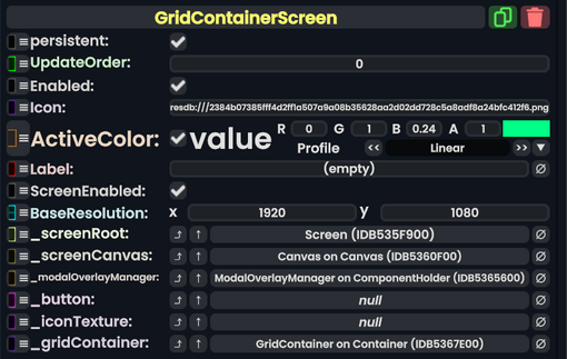
Grid Container Screen component as seen in the Scene Inspector

The GridContainerScreen component can be used to add additional tabs to the dash and is used in some custom tab facets for the Dash Menu.
Fields
| Name | Type | Description |
|---|---|---|
persistent
|
Bool | Determines whether or not this item will be saved to the server. |
UpdateOrder
|
Int | Controls the order in which this component is updated. |
Enabled
|
Bool | Controls whether or not this component is enabled. Some components stop their functionality when this field is disabled, but some don't. |
Icon
|
Uri | The icon of the dash menu tab. |
ActiveColor
|
Nullable`1<ColorX> | The color when this dash menu screen tab is selected. |
Label
|
String | The text for this dash menu Screen tab. |
ScreenEnabled
|
Bool | Whether the screen is enabled for viewing. |
BaseResolution
|
Float2 | The default resolution of the tab screen. |
_screenRoot
|
Slot | The root slot of the screen view. |
_screenCanvas
|
Canvas | The canvas being used for the tab view. |
_modalOverlayManager
|
ModalOverlayManager | The Overlay manager being used for handling edit mode. |
_button
|
RadiantDashButton | The button to select this dash menu screen tab. |
_iconTexture
|
Texture2D | The texture being used for the icon of this dash menu tab. |
_gridContainer
|
GridContainer | The component handling the alignment of grid items on this screen. |
Usage
Can be used as part of a facet that adds an extra screen to the dash for facet placement or preset facets.
Examples
Dash mirrors and the RedX facet.