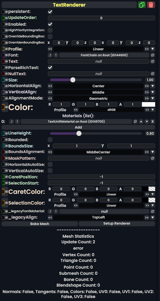
Component image 
Text Renderer component as seen in the Scene Inspector

This article or section is a stub. You can help the Resonite wiki by expanding it.
Tex renderer is a component that is used as the main part of a Basic, which is made via the create new menu using a DevTip
Usage
| Name | Type | Description |
|---|---|---|
persistent
|
Bool | Determines whether or not this item will be saved to the server. |
UpdateOrder
|
Int | Controls the order in which this component is updated. |
Enabled
|
Bool | Controls whether or not this component is enabled. Some components stop their functionality when this field is disabled, but some don't. |
HighPriorityIntegration
|
Bool | If true, integrating this asset (e.g. processing procedural assets) gets higher priority than assets with this flag off. An example is user laser procedural meshes. |
OverrideBoundingBox
|
Bool | Force the bounding box calculated from this component to use OverridenBoundingBox instead of calculating when requested.
|
OverridenBoundingBox
|
BoundingBox | the bounding box this component should say it has when OverrideBoundingBox is enabled. Useful for bounding box calculations with Flux, or changing the selection box for this component when rendered.
|
Profile
|
ColorProfile | The profile that the vertex colors for this mesh should be displayed in. |
Font
|
FontSet | The font set to use to render the text. For example, Times new Roman, or Avali Scratch. |
Text
|
String | The text to display. For example, "Hello world!" |
ParseRichText
|
Bool | whether to Parse rich text demoniators like "<b>" for bold and "<i>" for itallic |
NullText
|
String | the text to display if Text is null. (Empty text doesn't count)
|
Size
|
Float | how big to render the text as. |
HorizontalAlign
|
TextHorizontalAlignment | How to align the text horizontally. |
VerticalAlign
|
TextVerticalAlignment | how to align the text vertically. |
AlignmentMode
|
AlignmentMode | |
Color
|
ColorX | what color to render the text in. |
Materials
|
list of Material | what materials to render the text as. Really only works with Unlit Text Material type. |
LineHeight
|
Float | how much space each text line should take up |
Bounded
|
Bool | whether to restrict the text within a certain area |
BoundsSize
|
Float2 | the area to use if Bounded is enabled.
|
BoundsAlignment
|
Alignment | how to align the text to the bounds and therefore how to handle text that spills out. |
MaskPattern
|
String | a string to replace every character in Text with when rendering. Useful for password fields.
|
HorizontalAutoSize
|
Bool | whether to scale the text to fit the bounds horizontally |
VerticalAutoSize
|
Bool | whether to scale the text to fit the bounds vertically |
CaretPosition
|
Int | Where the typing cursor position is within the text by character index. |
SelectionStart
|
Int | where the selection starts if the text is being edited currently. |
CaretColor
|
ColorX | the color of the typing cursor |
SelectionColor
|
ColorX | the color of the typing selection. |
_legacyFontMaterial
|
FontMaterial | Internal. |
_legacyAlign
|
Alignment | Internal. |
Behavior
Examples
Used in the "Basic" and "Outlined" text objects in the create new menu using a DevTip. It's also useful in making physical UI's, and for signs. Anything generally text related that can be simple.