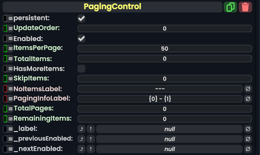
Component image 
Paging Control component as seen in the Scene Inspector

The PagingControl component allows for counting up a number of items specified, then outputs it to either a Text or TextRenderer component.
Fields
| Name | Type | Description |
|---|---|---|
persistent
|
Bool | Determines whether or not this item will be saved to the server. |
UpdateOrder
|
Int | Controls the order in which this component is updated. |
Enabled
|
Bool | Controls whether or not this component is enabled. Some components stop their functionality when this field is disabled, but some don't. |
ItemsPerPage
|
Int | The increment to count up by. |
TotalItems
|
Int | The total amount of items. |
HasMoreItems
|
Bool | Allows to count beyond the max set of items. |
SkipItems
|
Int | Skips items that are listed here. |
NoItemsLabel
|
String | Shows the output as this when there are no items. |
PagingInfoLabel
|
String | The structure of how the items will be shown to the user. |
TotalPages
|
raw output of Int | The total amount of items. |
RemainingItems
|
raw output of Int | Shows how many items are remaining. |
_label
|
field drive of String | The text to output. |
_previousEnabled
|
field drive of Bool | Becomes false if the minimum is currently reached. |
_nextEnabled
|
field drive of Bool | Becomes false if the maximum is currently reached. |
Sync Delegates
| Method Name | Method type and Arguments. | Is the method hidden? | Description |
|---|---|---|---|
NextPage()
|
Delegate<IButton: button, ButtonEventData: eventData> | X | PreviousPage() |
Delegate<IButton: button, ButtonEventData: eventData>
|
|
X | Action |
|
PreviousPage() | X |
Usage
Great for counting items.