Component:LegacyNumericUpDown
From Resonite Wiki
More actions
Component image 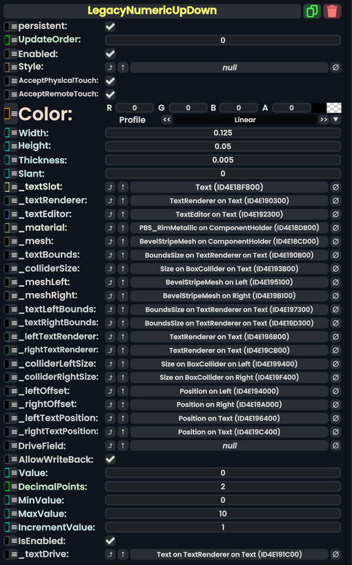
Legacy Numeric Up Down component as seen in the Scene Inspector

The LegacyNumericUpDown component comes from Legacy migrated content. This component should not be used in new content, and should be removed when possible.
Fields
| Name | Type | Description |
|---|---|---|
persistent
|
Bool | Determines whether or not this item will be saved to the server. |
UpdateOrder
|
Int | Controls the order in which this component is updated. |
Enabled
|
Bool | Controls whether or not this component is enabled. Some components stop their functionality when this field is disabled, but some don't. |
Style
|
direct RelayRef`1<LegacyUIStyle> | The source of the legacy color styles for this component. |
AcceptPhysicalTouch
|
Bool | Whether to allow Component:TipTouchSources to interact with/activate this component. |
AcceptRemoteTouch
|
Bool | Whether this component allows interaction via the user's interaction laser. |
Color
|
ColorX | The color of the UI elements. |
Width
|
Float | The width of the UI. |
Height
|
Float | The height of the UI. |
Thickness
|
Float | The thickness of the UI. |
Slant
|
Float | How beveled the UI elements should be. |
_textSlot
|
Slot | the slot of the text for the number this component is editing. |
_textRenderer
|
TextRenderer | The text renderer for the number this component is editing. |
_textEditor
|
TextEditor | The text editor that allows for direct editing of the number this component is editing. |
_material
|
reference drive of PBS_RimMetallic | The material this UI is using. |
_mesh
|
reference drive of BevelStripeMesh | The mesh this UI is using. |
_textBounds
|
field drive of Float2 | The field to drive to make the UI fit around the text. |
_colliderSize
|
field drive of Float3 | The field of the collider size for this UI. |
_meshLeft
|
reference drive of BevelStripeMesh | The mesh being used by this component's left button. |
_meshRight
|
reference drive of BevelStripeMesh | The mesh being used by this component's right button. |
_textLeftBounds
|
field drive of Float2 | The field to drive to make the left button stay wrapped around its text. |
_textRightBounds
|
field drive of Float2 | The field to drive to make the right button stay wrapped around its text. |
_leftTextRenderer
|
TextRenderer | The text renderer for the left button. |
_rightTextRenderer
|
TextRenderer | The text renderer for the right button. |
_colliderLeftSize
|
field drive of Float3 | The collider size field of the left button. |
_colliderRightSize
|
field drive of Float3 | The collider size field of the right button. |
_leftOffset
|
field drive of Float3 | The collider offset field of the left button. |
_rightOffset
|
field drive of Float3 | The collider offset field of the right button. |
_leftTextPosition
|
field drive of Float3 | The text position field of the left button. |
_rightTextPosition
|
field drive of Float3 | The text position field of the right button. |
DriveField
|
field drive of Float | The field this component should drive with Value
|
AllowWriteBack
|
Bool | Whether changes to the value of the field targeted by DriveField should be written to this component's Value field instead.
|
Value
|
Float | The value that this component currently has for the edited field. |
DecimalPoints
|
Int | How many decimal places this component should keep track of. |
MinValue
|
Float | The minimum possible value for Value.
|
MaxValue
|
Float | The maximum possible value for Value.
|
IncrementValue
|
Float | How much to increment or decrement Value by when pressing the left and right buttons.
|
IsEnabled
|
Bool | Whether this Legacy UI element is enabled and usable. |
_textDrive
|
field drive of String | The string field to drive with the current Value for the visuals.
|
Usage
Just dont.
Examples
This article or section is a stub. You can help the Resonite wiki by expanding it.