Component:ContextMenuItem
A component that is used internally within context menus. If you want to create a custom context menu, you should look at ContextMenuItemSource.
More actions
Component image 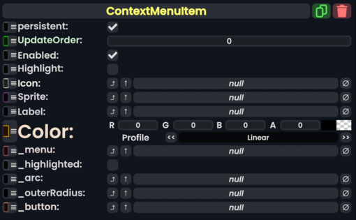
Context Menu Item component as seen in the Scene Inspector

A component that is used internally within context menus. If you want to create a custom context menu, you should look at ContextMenuItemSource.
Fields
| Name | Type | Description |
|---|---|---|
persistent
|
Bool | Determines whether or not this item will be saved to the server. |
UpdateOrder
|
Int | Controls the order in which this component is updated. |
Enabled
|
Bool | Controls whether or not this component is enabled. Some components stop their functionality when this field is disabled, but some don't. |
Highlight
|
Bool | Set and unset whether the item is being hovered over and should be highlighted. |
Icon
|
Image | The icon of this item. |
Sprite
|
direct RelayRef`1<IAssetProvider`1<Sprite>> | The sprite of this item. |
Label
|
IField`1<String> | The label element of this item. |
Color
|
ColorX | The color of this item. |
_menu
|
ContextMenu | This item's origin context menu. |
_highlighted
|
Bool | The item is being hovered over. |
_arc
|
field drive of Float | The arc that makes up this item. |
_outerRadius
|
field drive of Float | The field that specifies the outer radius of this item. |
_button
|
Button | The button that makes up this item. |