(Redirected from LegacyButton (Component))
Component image 
Legacy Button component as seen in the Scene Inspector
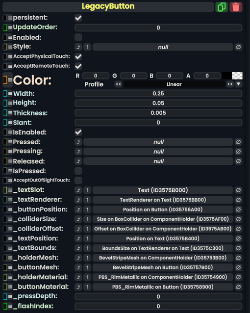
The LegacyButton component is a leftover Component from content migrated from other platforms. It should not be used, and should be replaced whenever possible.
Usage
Name | Type | Description |
---|---|---|
persistent
|
Bool | Determines whether or not this item will be saved to the server. |
UpdateOrder
|
Int | Controls the order in which this component is updated. |
Enabled
|
Bool | Controls whether or not this component is enabled. Some components stop their functionality when this field is disabled, but some don't. |
Style
|
direct RelayRef`1<LegacyUIStyle> | The source of the legacy color styles for this component. |
AcceptPhysicalTouch
|
Bool | Whether to allow Component:TipTouchSources to interact with/activate this component. |
AcceptRemoteTouch
|
Bool | Whether this component allows interaction via the user's interaction laser. |
Color
|
ColorX | The color of the button. |
Width
|
Float | The width of the button. |
Height
|
Float | The height of the button. |
Thickness
|
Float | How thick the button is. |
Slant
|
Float | How much Bevel the button should have. |
IsEnabled
|
Bool | Whether this Legacy UI element is enabled and usable. |
Pressed
|
delegate of identity ButtonEventHandler | The Sync delegate to call when this button is pressed. |
Pressing
|
delegate of identity ButtonEventHandler | The Sync delegate to call per engine update as this button is being held down. |
Released
|
delegate of identity ButtonEventHandler | The Sync delegate to call when this button has stopped being pressed. |
IsPressed
|
Bool | Whether the button is being pressed currently. |
AcceptOutOfSightTouch
|
Bool | Whether this button accepts interaction if the user isn't looking at it. |
_textSlot
|
Slot | The slot of the text visual for this button. |
_textRenderer
|
TextRenderer | The text renderer for this button. |
_buttonPosition
|
field drive of Float3 | The position field for this button for physical pressing. |
_colliderSize
|
field drive of Float3 | The collider size field for this button's collider. |
_colliderOffset
|
field drive of Float3 | The collider offset field for this button's collider. |
_textPosition
|
field drive of Float3 | The text position field for this button's text |
_textBounds
|
field drive of Float2 | The 2d bounds of this button's text |
_holderMesh
|
reference drive of BevelStripeMesh | The mesh that is containing this button (like a parent UI. |
_buttonMesh
|
reference drive of BevelStripeMesh | The Bevel mesh that makes up this button's visual. |
_holderMaterial
|
reference drive of PBS_RimMetallic | The material of the parent UI mesh. |
_buttonMaterial
|
reference drive of PBS_RimMetallic | The material of this button's mesh visual |
_pressDepth
|
Float | How far the user is currently pressing the button physically |
_flashIndex
|
Int | How much to add to the emission of the holder material. |
Usage
Just no.
Examples
Old content that has a yellow color schema.