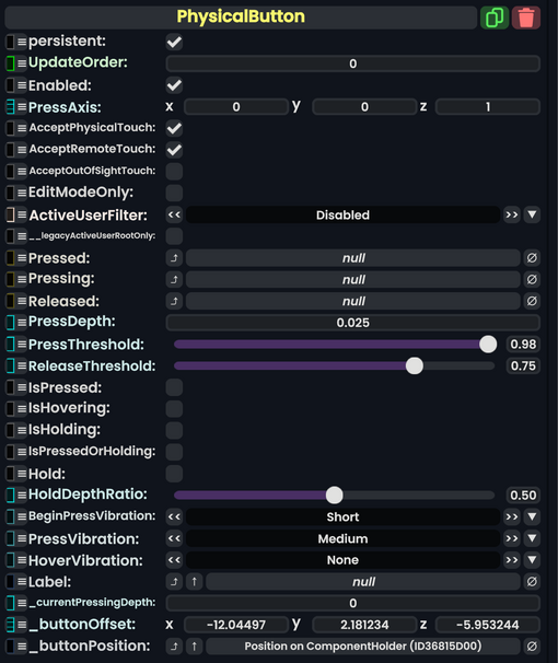
Component:PhysicalButton
More actions

The PhysicalButton component can be used to create buttons that move inward when pressed by a user, a press depth and threshold can be set to customize the physical feeling of the button.
Fields
| Name | Type | Description |
|---|---|---|
persistent
|
Bool | Determines whether or not this item will be saved to the server. |
UpdateOrder
|
Int | Controls the order in which this component is updated. |
Enabled
|
Bool | Controls whether or not this component is enabled. Some components stop their functionality when this field is disabled, but some don't. |
PressAxis
|
Float3 | The direction in local space to go when pressing the button |
AcceptPhysicalTouch
|
Bool | Whether to allow Component:TipTouchSources to interact with/activate this component. |
AcceptRemoteTouch
|
Bool | Whether this component allows interaction via the user's interaction laser. |
AcceptOutOfSightTouch
|
Bool | Whether or not to allow interaction with this component if it is out of the user's view. |
EditModeOnly
|
Bool | Whether this button can only be pressed if the user is in Edit Mode |
ActiveUserFilter
|
ActiveUserHandling | How to filter in or out the active user of this component. |
__legacyActiveUserRootOnly
|
Bool | Whether to use the legacy active user root only option. |
Pressed
|
delegate of identity ButtonEventHandler | A sync delegate to call when the button is pressed. |
Pressing
|
delegate of identity ButtonEventHandler | A sync delegate to call when the button is being pressed. is called every game update while the button is held down. |
Released
|
delegate of identity ButtonEventHandler | A sync delegate to call when the button is released. |
PressDepth
|
Float | The max distance the button can move in PressAxis direction
|
PressThreshold
|
Float | If pressed more than this amount, the button is considered pressed. |
ReleaseThreshold
|
Float | If pressed less than this amount, the button is considered released. |
IsPressed
|
Bool | Whether the user has the button pressed. |
IsHovering
|
Bool | Whether the user is hovering their interaction source at the button (laser or tip touch source) |
IsHolding
|
Bool | Whether the user is holding the button. |
IsPressedOrHolding
|
raw output of Bool | Whether the button is being held down or being pressed. |
Hold
|
Bool | Whether the button can be held down. |
HoldDepthRatio
|
Float | How far the button has to be pressed before it is considered being held down. |
BeginPressVibration
|
VibratePreset | How to vibrate a user's hand when they begin to press the button. |
PressVibration
|
VibratePreset | How to vibrate a user's hand when they press the button. |
HoverVibration
|
VibratePreset | How to vibrate a user's hand when they point at the button. |
Label
|
IField`1<String> | The field to drive with a label describing this button. |
_currentPressingDepth
|
Float | The current amount that the button is being pushed down. |
_buttonOffset
|
Float3 | The initial position of the button's transforms in local space. |
_buttonPosition
|
field drive of Float3 | the field to drive to influence the position of the button for pressing. |
Usage
Attach to a slot under another slot. the slot hiearchy this is on should have a collider in order to be able to press the button. Hooking this up to ProtoFlux, or using the Button Events this generates will give this button functionality.
Miscellaneous Notes
When adding this component to an object that has the Grabbable component, you will notice that the object may not be grabbable anymore. To remedy this, create a child object on the main object you want to be your button. Then, on that child object, attach this component. You should now have an object that is grabbable and functions as a button.