Automated: create new component page |
989onan bot (talk | contribs) Automated: Added {{Legacy}} |
||
| (3 intermediate revisions by one other user not shown) | |||
| Line 1: | Line 1: | ||
{{Infobox Component | {{Legacy}}{{Infobox Component | ||
|Image=LegacyButtonComponent.png | |Image=LegacyButtonComponent.png | ||
|Name=Legacy Button | |Name=Legacy Button | ||
}} | }} | ||
The '''LegacyButton''' component is a leftover Component from content migrated from other platforms. It should not be used, and should be replaced whenever possible. | |||
== Usage == | == Usage == | ||
{{Table ComponentFields | {{Table ComponentFields | ||
|Style|{{RootFieldType|RelayRef`1|[[Component:LegacyUIStyle|LegacyUIStyle]]}}|TypeAdv0=true| | |Style|{{RootFieldType|RelayRef`1|[[Component:LegacyUIStyle|LegacyUIStyle]]}}|TypeAdv0=true| {{Template:LegacyUI_Style}} | ||
|AcceptPhysicalTouch|Bool| | |AcceptPhysicalTouch|Bool| {{Template:Touchable_AcceptPhysicalTouch}} | ||
|AcceptRemoteTouch|Bool| | |AcceptRemoteTouch|Bool| {{Template:Touchable_AcceptRemoteTouch}} | ||
|Color|ColorX| | |Color|ColorX| The color of the button. | ||
|Width|Float| | |Width|Float| The width of the button. | ||
|Height|Float| | |Height|Float| The height of the button. | ||
|Thickness|Float| | |Thickness|Float| How thick the button is. | ||
|Slant|Float| | |Slant|Float| How much Bevel the button should have. | ||
|IsEnabled|Bool| | |IsEnabled|Bool| {{Template:LegacyUI_IsEnabled}} | ||
|Pressed|{{RootFieldType|SyncDelegate`1|[[Type:ButtonEventHandler|ButtonEventHandler]]}}|TypeAdv9=true| | |Pressed|{{RootFieldType|SyncDelegate`1|[[Type:ButtonEventHandler|ButtonEventHandler]]}}|TypeAdv9=true| The Sync delegate to call when this button is pressed. | ||
|Pressing|{{RootFieldType|SyncDelegate`1|[[Type:ButtonEventHandler|ButtonEventHandler]]}}|TypeAdv10=true| | |Pressing|{{RootFieldType|SyncDelegate`1|[[Type:ButtonEventHandler|ButtonEventHandler]]}}|TypeAdv10=true| The Sync delegate to call per engine update as this button is being held down. | ||
|Released|{{RootFieldType|SyncDelegate`1|[[Type:ButtonEventHandler|ButtonEventHandler]]}}|TypeAdv11=true| | |Released|{{RootFieldType|SyncDelegate`1|[[Type:ButtonEventHandler|ButtonEventHandler]]}}|TypeAdv11=true| The Sync delegate to call when this button has stopped being pressed. | ||
|IsPressed|Bool| | |IsPressed|Bool| Whether the button is being pressed currently. | ||
|AcceptOutOfSightTouch|Bool| | |AcceptOutOfSightTouch|Bool| Whether this button accepts interaction if the user isn't looking at it. | ||
|_textSlot|Slot| | |_textSlot|Slot| The slot of the text visual for this button. | ||
|_textRenderer|'''[[Component:TextRenderer|TextRenderer]]'''|TypeAdv15=true| | |_textRenderer|'''[[Component:TextRenderer|TextRenderer]]'''|TypeAdv15=true| The text renderer for this button. | ||
|_buttonPosition|{{RootFieldType|FieldDrive`1|[[Type:Float3|Float3]]}}|TypeAdv16=true| | |_buttonPosition|{{RootFieldType|FieldDrive`1|[[Type:Float3|Float3]]}}|TypeAdv16=true| The position field for this button for physical pressing. | ||
|_colliderSize|{{RootFieldType|FieldDrive`1|[[Type:Float3|Float3]]}}|TypeAdv17=true| | |_colliderSize|{{RootFieldType|FieldDrive`1|[[Type:Float3|Float3]]}}|TypeAdv17=true| The collider size field for this button's collider. | ||
|_colliderOffset|{{RootFieldType|FieldDrive`1|[[Type:Float3|Float3]]}}|TypeAdv18=true| | |_colliderOffset|{{RootFieldType|FieldDrive`1|[[Type:Float3|Float3]]}}|TypeAdv18=true| The collider offset field for this button's collider. | ||
|_textPosition|{{RootFieldType|FieldDrive`1|[[Type:Float3|Float3]]}}|TypeAdv19=true| | |_textPosition|{{RootFieldType|FieldDrive`1|[[Type:Float3|Float3]]}}|TypeAdv19=true| The text position field for this button's text | ||
|_textBounds|{{RootFieldType|FieldDrive`1|[[Type:Float2|Float2]]}}|TypeAdv20=true| | |_textBounds|{{RootFieldType|FieldDrive`1|[[Type:Float2|Float2]]}}|TypeAdv20=true| The 2d bounds of this button's text | ||
|_holderMesh|{{RootFieldType|DriveRef`1|[[Component:BevelStripeMesh|BevelStripeMesh]]}}|TypeAdv21=true| | |_holderMesh|{{RootFieldType|DriveRef`1|[[Component:BevelStripeMesh|BevelStripeMesh]]}}|TypeAdv21=true| The mesh that is containing this button (like a parent UI. | ||
|_buttonMesh|{{RootFieldType|DriveRef`1|[[Component:BevelStripeMesh|BevelStripeMesh]]}}|TypeAdv22=true| | |_buttonMesh|{{RootFieldType|DriveRef`1|[[Component:BevelStripeMesh|BevelStripeMesh]]}}|TypeAdv22=true| The Bevel mesh that makes up this button's visual. | ||
|_holderMaterial|{{RootFieldType|DriveRef`1|[[PBS_RimMetallic|PBS_RimMetallic]]}}|TypeAdv23=true| | |_holderMaterial|{{RootFieldType|DriveRef`1|[[PBS_RimMetallic|PBS_RimMetallic]]}}|TypeAdv23=true| The material of the parent UI mesh. | ||
|_buttonMaterial|{{RootFieldType|DriveRef`1|[[PBS_RimMetallic|PBS_RimMetallic]]}}|TypeAdv24=true| | |_buttonMaterial|{{RootFieldType|DriveRef`1|[[PBS_RimMetallic|PBS_RimMetallic]]}}|TypeAdv24=true| The material of this button's mesh visual | ||
|_pressDepth|Float| | |_pressDepth|Float| How far the user is currently pressing the button physically | ||
|_flashIndex|Int| | |_flashIndex|Int| How much to add to the emission of the holder material. | ||
}} | }} | ||
== | == Usage == | ||
Just no. | |||
== Examples == | == Examples == | ||
Old content that has a yellow color schema. | |||
== See Also == | == See Also == | ||
| Line 44: | Line 46: | ||
[[Category:Components:UI:Physical{{#translation:}}|Legacy Button]] | [[Category:Components:UI:Physical{{#translation:}}|Legacy Button]] | ||
[[Category:Components{{#translation:}}|Legacy Button]] | [[Category:Components{{#translation:}}|Legacy Button]] | ||
Latest revision as of 03:43, 7 April 2025
Component image 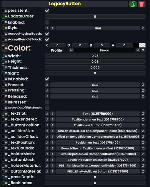
Legacy Button component as seen in the Scene Inspector

The LegacyButton component is a leftover Component from content migrated from other platforms. It should not be used, and should be replaced whenever possible.
Usage
| Name | Type | Description |
|---|---|---|
persistent
|
Bool | Determines whether or not this item will be saved to the server. |
UpdateOrder
|
Int | Controls the order in which this component is updated. |
Enabled
|
Bool | Controls whether or not this component is enabled. Some components stop their functionality when this field is disabled, but some don't. |
Style
|
direct RelayRef`1<LegacyUIStyle> | The source of the legacy color styles for this component. |
AcceptPhysicalTouch
|
Bool | Whether to allow Component:TipTouchSources to interact with/activate this component. |
AcceptRemoteTouch
|
Bool | Whether this component allows interaction via the user's interaction laser. |
Color
|
ColorX | The color of the button. |
Width
|
Float | The width of the button. |
Height
|
Float | The height of the button. |
Thickness
|
Float | How thick the button is. |
Slant
|
Float | How much Bevel the button should have. |
IsEnabled
|
Bool | Whether this Legacy UI element is enabled and usable. |
Pressed
|
delegate of identity ButtonEventHandler | The Sync delegate to call when this button is pressed. |
Pressing
|
delegate of identity ButtonEventHandler | The Sync delegate to call per engine update as this button is being held down. |
Released
|
delegate of identity ButtonEventHandler | The Sync delegate to call when this button has stopped being pressed. |
IsPressed
|
Bool | Whether the button is being pressed currently. |
AcceptOutOfSightTouch
|
Bool | Whether this button accepts interaction if the user isn't looking at it. |
_textSlot
|
Slot | The slot of the text visual for this button. |
_textRenderer
|
TextRenderer | The text renderer for this button. |
_buttonPosition
|
field drive of Float3 | The position field for this button for physical pressing. |
_colliderSize
|
field drive of Float3 | The collider size field for this button's collider. |
_colliderOffset
|
field drive of Float3 | The collider offset field for this button's collider. |
_textPosition
|
field drive of Float3 | The text position field for this button's text |
_textBounds
|
field drive of Float2 | The 2d bounds of this button's text |
_holderMesh
|
reference drive of BevelStripeMesh | The mesh that is containing this button (like a parent UI. |
_buttonMesh
|
reference drive of BevelStripeMesh | The Bevel mesh that makes up this button's visual. |
_holderMaterial
|
reference drive of PBS_RimMetallic | The material of the parent UI mesh. |
_buttonMaterial
|
reference drive of PBS_RimMetallic | The material of this button's mesh visual |
_pressDepth
|
Float | How far the user is currently pressing the button physically |
_flashIndex
|
Int | How much to add to the emission of the holder material. |
Usage
Just no.
Examples
Old content that has a yellow color schema.