(One intermediate revision by one other user not shown)
Line 1:
Line 1:
{{Infobox Component
{{Legacy}}{{Infobox Component
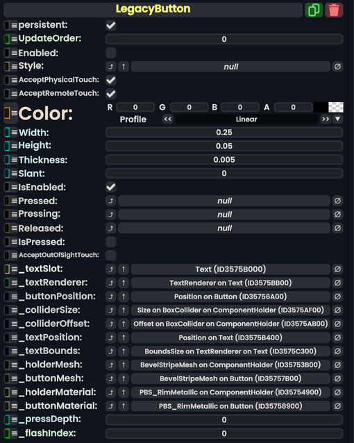
|Image=LegacyButtonComponent.png
|Image=LegacyButtonComponent.png
|Name=Legacy Button
|Name=Legacy Button
Line 15:
Line 15:
|Thickness|Float| How thick the button is.
|Thickness|Float| How thick the button is.
|Slant|Float| How much Bevel the button should have.
|Slant|Float| How much Bevel the button should have.
|IsEnabled|Bool| Whether the button is enabled and can be used.
|IsEnabled|Bool| {{Template:LegacyUI_IsEnabled}}
|Pressed|{{RootFieldType|SyncDelegate`1|[[Type:ButtonEventHandler|ButtonEventHandler]]}}|TypeAdv9=true| The Sync delegate to call when this button is pressed.
|Pressed|{{RootFieldType|SyncDelegate`1|[[Type:ButtonEventHandler|ButtonEventHandler]]}}|TypeAdv9=true| The Sync delegate to call when this button is pressed.
|Pressing|{{RootFieldType|SyncDelegate`1|[[Type:ButtonEventHandler|ButtonEventHandler]]}}|TypeAdv10=true| The Sync delegate to call per engine update as this button is being held down.
|Pressing|{{RootFieldType|SyncDelegate`1|[[Type:ButtonEventHandler|ButtonEventHandler]]}}|TypeAdv10=true| The Sync delegate to call per engine update as this button is being held down.
Latest revision as of 03:43, 7 April 2025
This article describes a feature marked as legacy—this usually means there's a newer, better alternative. Legacy features might not be removed but they will not be updated, and the team will not provide any support for them.
The LegacyButton component is a leftover Component from content migrated from other platforms. It should not be used, and should be replaced whenever possible.