Created page with "A component that is used internally within context menus. If you want to create a custom context menu, you should look at ContextMenuItemSource."
A component that is used internally within context menus. If you want to create a custom context menu, you should look at [[ContextMenuItemSource_(Component)|ContextMenuItemSource]].
{{Infobox Component
|Image=ContextMenuItemComponent.png
|Name=Context Menu Item
}}
A component that is used internally within [[Context menu|context menus]]. If you want to create a custom context menu, you should look at [[Component:ContextMenuItemSource|ContextMenuItemSource]].
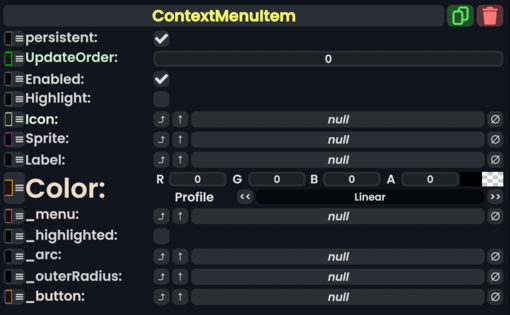
== Fields ==
{{Table ComponentFields
|Highlight|Bool| Set and unset whether the item is being hovered over and should be highlighted.
|Icon|'''[[Component:Image|Image]]'''|TypeAdv1=true| The icon of this item.
|Sprite|{{RootFieldType|RelayRef`1|[[Type:IAssetProvider`1|IAssetProvider`1]]<[[Type:Sprite|Sprite]]>}}|TypeAdv2=true| The sprite of this item.
|Label|'''[[Type:IField`1|IField`1]]<[[Type:String|String]]>'''|TypeAdv3=true| The label element of this item.
|Color|ColorX| The color of this item.
|_menu|'''[[Component:ContextMenu|ContextMenu]]'''|TypeAdv5=true| This item's origin context menu.
|_highlighted|Bool| The item is being hovered over.
|_arc|{{RootFieldType|FieldDrive`1|[[Type:Float|Float]]}}|TypeAdv7=true| The arc that makes up this item.
|_outerRadius|{{RootFieldType|FieldDrive`1|[[Type:Float|Float]]}}|TypeAdv8=true| The field that specifies the outer radius of this item.
|_button|'''[[Component:Button|Button]]'''|TypeAdv9=true| The button that makes up this item.