GreaseMonkey (talk | contribs) m GreaseMonkey moved page PhysicalButton (Component) to Component:PhysicalButton: Moving to Component namespace |
Automated: update Fields |
||
| Line 17: | Line 17: | ||
|ActiveUserFilter|ActiveUserHandling| | |ActiveUserFilter|ActiveUserHandling| | ||
|__legacyActiveUserRootOnly|Bool| | |__legacyActiveUserRootOnly|Bool| | ||
|Pressed| | |Pressed|{{RootFieldType|SyncDelegate`1|[[Type:ButtonEventHandler|ButtonEventHandler]]}}|TypeAdv7=true| | ||
|Pressing| | |Pressing|{{RootFieldType|SyncDelegate`1|[[Type:ButtonEventHandler|ButtonEventHandler]]}}|TypeAdv8=true| | ||
|Released| | |Released|{{RootFieldType|SyncDelegate`1|[[Type:ButtonEventHandler|ButtonEventHandler]]}}|TypeAdv9=true| | ||
|PressDepth|Float| | |PressDepth|Float| | ||
|PressThreshold|Float| | |PressThreshold|Float| | ||
| Line 25: | Line 25: | ||
|IsPressed|Bool| | |IsPressed|Bool| | ||
|IsHovering|Bool| | |IsHovering|Bool| | ||
|IsHolding|Bool| | |||
|IsPressedOrHolding|{{RootFieldType|RawOutput`1|[[Type:Bool|Bool]]}}|TypeAdv16=true| | |||
|Hold|Bool| | |||
|HoldDepthRatio|Float| | |||
|BeginPressVibration|VibratePreset| | |BeginPressVibration|VibratePreset| | ||
|PressVibration|VibratePreset| | |PressVibration|VibratePreset| | ||
|HoverVibration|VibratePreset| | |HoverVibration|VibratePreset| | ||
|Label|IField`1| | |Label|'''[[Type:IField`1|IField`1]]<[[Type:String|String]]>'''|TypeAdv22=true| | ||
|_currentPressingDepth|Float| | |_currentPressingDepth|Float| | ||
|_buttonOffset|Float3| | |_buttonOffset|Float3| | ||
|_buttonPosition| | |_buttonPosition|{{RootFieldType|FieldDrive`1|[[Type:Float3|Float3]]}}|TypeAdv25=true| | ||
}} | }} | ||
Revision as of 21:34, 3 March 2024
This article or section is a stub. You can help the Resonite wiki by expanding it.
Component image 
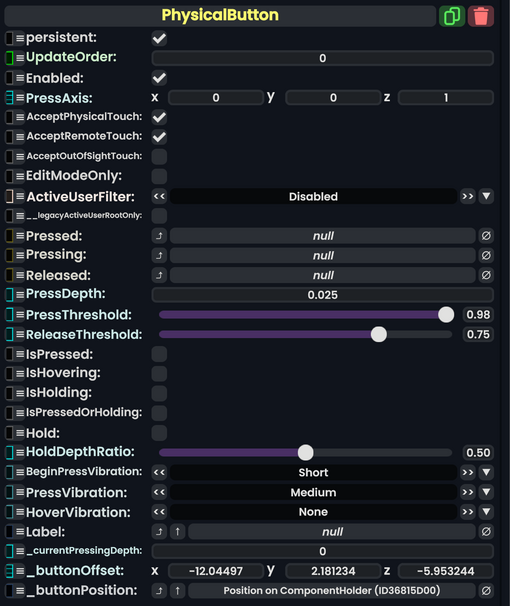
Physical Button component as seen in the Scene Inspector

The PhysicalButton component can be used to create buttons that move inward when pressed by a user, a press depth and threshold can be set to customize the physical feeling of the button.
Fields
| Name | Type | Description |
|---|---|---|
persistent
|
Bool | Determines whether or not this item will be saved to the server. |
UpdateOrder
|
Int | Controls the order in which this component is updated. |
Enabled
|
Bool | Controls whether or not this component is enabled. Some components stop their functionality when this field is disabled, but some don't. |
PressAxis
|
Float3 | |
AcceptPhysicalTouch
|
Bool | |
AcceptRemoteTouch
|
Bool | |
AcceptOutOfSightTouch
|
Bool | |
EditModeOnly
|
Bool | |
ActiveUserFilter
|
ActiveUserHandling | |
__legacyActiveUserRootOnly
|
Bool | |
Pressed
|
delegate of identity ButtonEventHandler | |
Pressing
|
delegate of identity ButtonEventHandler | |
Released
|
delegate of identity ButtonEventHandler | |
PressDepth
|
Float | |
PressThreshold
|
Float | |
ReleaseThreshold
|
Float | |
IsPressed
|
Bool | |
IsHovering
|
Bool | |
IsHolding
|
Bool | |
IsPressedOrHolding
|
raw output of Bool | |
Hold
|
Bool | |
HoldDepthRatio
|
Float | |
BeginPressVibration
|
VibratePreset | |
PressVibration
|
VibratePreset | |
HoverVibration
|
VibratePreset | |
Label
|
IField`1<String> | |
_currentPressingDepth
|
Float | |
_buttonOffset
|
Float3 | |
_buttonPosition
|
field drive of Float3 |
Usage
Examples
Related Components
Miscellaneous Notes
When adding this component to an object that has the Grabbable component, you will notice that the object may not be grabbable anymore. To remedy this, create a child object on the main object you want to be your button. Then, on that child object, attach this component. You should now have an object that is grabbable and functions as a button.