Component:LegacyCheckbox: Difference between revisions
From Resonite Wiki
More actions
Automated: create new component page |
add info |
||
| Line 3: | Line 3: | ||
|Name=Legacy Checkbox | |Name=Legacy Checkbox | ||
}} | }} | ||
The '''LegacyCheckbox''' component is used in old migrated content. This is a Legacy component and should not be used for new content. This should be replaced whenever possible. | |||
== | == Fields == | ||
{{Table ComponentFields | {{Table ComponentFields | ||
|Style|{{RootFieldType|RelayRef`1|[[Component:LegacyUIStyle|LegacyUIStyle]]}}|TypeAdv0=true| | |Style|{{RootFieldType|RelayRef`1|[[Component:LegacyUIStyle|LegacyUIStyle]]}}|TypeAdv0=true| {{Template:LegacyUI_Style}} | ||
|AcceptPhysicalTouch|Bool| | |AcceptPhysicalTouch|Bool| {{Template:Touchable_AcceptPhysicalTouch}} | ||
|AcceptRemoteTouch|Bool| | |AcceptRemoteTouch|Bool| {{Template:Touchable_AcceptRemoteTouch}} | ||
|IsChecked|Bool| | |IsChecked|Bool| Whether the checkbox is checked. | ||
|IsEnabled|Bool| | |IsEnabled|Bool| {{Template:LegacyUI_IsEnabled}} | ||
|DriveField|{{RootFieldType|FieldDrive`1|[[Type:Bool|Bool]]}}|TypeAdv5=true| | |DriveField|{{RootFieldType|FieldDrive`1|[[Type:Bool|Bool]]}}|TypeAdv5=true| The field to drive with this checkbooks state. | ||
|AllowWriteBack|Bool| | |AllowWriteBack|Bool| Whether changes to the target value of <code>DriveField</code> are sent to this component's checked state instead. | ||
|Size|Float| | |Size|Float| How big the check box is. | ||
|BevelPercent|Float| | |BevelPercent|Float| How beveled the check box is. | ||
|Color|ColorX| | |Color|ColorX| The color of the check box. | ||
|_shellMesh|'''[[Component:BevelBoxMesh|BevelBoxMesh]]'''|TypeAdv10=true| | |_shellMesh|'''[[Component:BevelBoxMesh|BevelBoxMesh]]'''|TypeAdv10=true| The outer shell of the check box. | ||
|_checkMesh|'''[[Component:BevelBoxMesh|BevelBoxMesh]]'''|TypeAdv11=true| | |_checkMesh|'''[[Component:BevelBoxMesh|BevelBoxMesh]]'''|TypeAdv11=true| The inner check box indicator of the check box. | ||
|_titleBar|'''[[Component:LegacyHorizontalChoiceBar|LegacyHorizontalChoiceBar]]'''|TypeAdv12=true| | |_titleBar|'''[[Component:LegacyHorizontalChoiceBar|LegacyHorizontalChoiceBar]]'''|TypeAdv12=true| unused. | ||
|_shellSize|{{RootFieldType|FieldDrive`1|[[Type:Float3|Float3]]}}|TypeAdv13=true| | |_shellSize|{{RootFieldType|FieldDrive`1|[[Type:Float3|Float3]]}}|TypeAdv13=true| The field to drive for the outer shell size mesh. | ||
|_shellBevel|{{RootFieldType|FieldDrive`1|[[Type:Float|Float]]}}|TypeAdv14=true| | |_shellBevel|{{RootFieldType|FieldDrive`1|[[Type:Float|Float]]}}|TypeAdv14=true| The field to drive for the outer shell bevel. | ||
|_checkSize|{{RootFieldType|FieldDrive`1|[[Type:Float3|Float3]]}}|TypeAdv15=true| | |_checkSize|{{RootFieldType|FieldDrive`1|[[Type:Float3|Float3]]}}|TypeAdv15=true| The field to drive for the check indicator size. | ||
|_checkBevel|{{RootFieldType|FieldDrive`1|[[Type:Float|Float]]}}|TypeAdv16=true| | |_checkBevel|{{RootFieldType|FieldDrive`1|[[Type:Float|Float]]}}|TypeAdv16=true| The field to drive for the check indicator bevel. | ||
|_colliderSize|{{RootFieldType|FieldDrive`1|[[Type:Float3|Float3]]}}|TypeAdv17=true| | |_colliderSize|{{RootFieldType|FieldDrive`1|[[Type:Float3|Float3]]}}|TypeAdv17=true| The field to drive for the collider size. | ||
|_shellMaterial|{{RootFieldType|DriveRef`1|[[PBS_RimMetallic|PBS_RimMetallic]]}}|TypeAdv18=true| | |_shellMaterial|{{RootFieldType|DriveRef`1|[[PBS_RimMetallic|PBS_RimMetallic]]}}|TypeAdv18=true| The field to drive to set the shell material. | ||
|_checkMaterial|{{RootFieldType|DriveRef`1|[[PBS_RimMetallic|PBS_RimMetallic]]}}|TypeAdv19=true| | |_checkMaterial|{{RootFieldType|DriveRef`1|[[PBS_RimMetallic|PBS_RimMetallic]]}}|TypeAdv19=true| The field to drive to set the check indicator material. | ||
}} | }} | ||
== | == Usage == | ||
Just dont. | |||
== Examples == | == Examples == | ||
{{stub}} | |||
== See Also == | == See Also == | ||
| Line 37: | Line 39: | ||
[[Category:Components:UI:Physical{{#translation:}}|Legacy Checkbox]] | [[Category:Components:UI:Physical{{#translation:}}|Legacy Checkbox]] | ||
[[Category:Components{{#translation:}}|Legacy Checkbox]] | [[Category:Components{{#translation:}}|Legacy Checkbox]] | ||
Revision as of 17:51, 21 January 2025
Component image 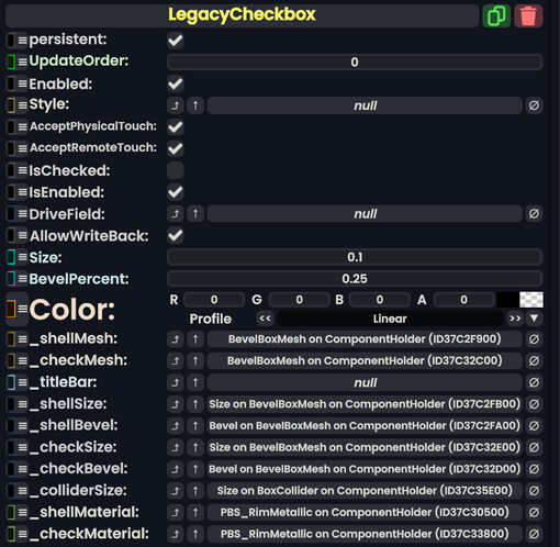
Legacy Checkbox component as seen in the Scene Inspector

The LegacyCheckbox component is used in old migrated content. This is a Legacy component and should not be used for new content. This should be replaced whenever possible.
Fields
| Name | Type | Description |
|---|---|---|
persistent
|
Bool | Determines whether or not this item will be saved to the server. |
UpdateOrder
|
Int | Controls the order in which this component is updated. |
Enabled
|
Bool | Controls whether or not this component is enabled. Some components stop their functionality when this field is disabled, but some don't. |
Style
|
direct RelayRef`1<LegacyUIStyle> | The source of the legacy color styles for this component. |
AcceptPhysicalTouch
|
Bool | Whether to allow Component:TipTouchSources to interact with/activate this component. |
AcceptRemoteTouch
|
Bool | Whether this component allows interaction via the user's interaction laser. |
IsChecked
|
Bool | Whether the checkbox is checked. |
IsEnabled
|
Bool | Whether this Legacy UI element is enabled and usable. |
DriveField
|
field drive of Bool | The field to drive with this checkbooks state. |
AllowWriteBack
|
Bool | Whether changes to the target value of DriveField are sent to this component's checked state instead.
|
Size
|
Float | How big the check box is. |
BevelPercent
|
Float | How beveled the check box is. |
Color
|
ColorX | The color of the check box. |
_shellMesh
|
BevelBoxMesh | The outer shell of the check box. |
_checkMesh
|
BevelBoxMesh | The inner check box indicator of the check box. |
_titleBar
|
LegacyHorizontalChoiceBar | unused. |
_shellSize
|
field drive of Float3 | The field to drive for the outer shell size mesh. |
_shellBevel
|
field drive of Float | The field to drive for the outer shell bevel. |
_checkSize
|
field drive of Float3 | The field to drive for the check indicator size. |
_checkBevel
|
field drive of Float | The field to drive for the check indicator bevel. |
_colliderSize
|
field drive of Float3 | The field to drive for the collider size. |
_shellMaterial
|
reference drive of PBS_RimMetallic | The field to drive to set the shell material. |
_checkMaterial
|
reference drive of PBS_RimMetallic | The field to drive to set the check indicator material. |
Usage
Just dont.
Examples
This article or section is a stub. You can help the Resonite wiki by expanding it.