|Slant|Float| How much Bevel the button should have.
|Slant|Float| How much Bevel the button should have.
|IsEnabled|Bool| Whether the button is enabled and can be used.
|IsEnabled|Bool| {{Template:LegacyUI_IsEnabled}}
|Pressed|{{RootFieldType|SyncDelegate`1|[[Type:ButtonEventHandler|ButtonEventHandler]]}}|TypeAdv9=true| The Sync delegate to call when this button is pressed.
|Pressed|{{RootFieldType|SyncDelegate`1|[[Type:ButtonEventHandler|ButtonEventHandler]]}}|TypeAdv9=true| The Sync delegate to call when this button is pressed.
|Pressing|{{RootFieldType|SyncDelegate`1|[[Type:ButtonEventHandler|ButtonEventHandler]]}}|TypeAdv10=true| The Sync delegate to call per engine update as this button is being held down.
|Pressing|{{RootFieldType|SyncDelegate`1|[[Type:ButtonEventHandler|ButtonEventHandler]]}}|TypeAdv10=true| The Sync delegate to call per engine update as this button is being held down.
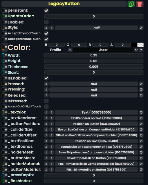
The LegacyButton component is a leftover Component from content migrated from other platforms. It should not be used, and should be replaced whenever possible.