Component:LegacyEnumEditor
From Resonite Wiki
More actions
Component image 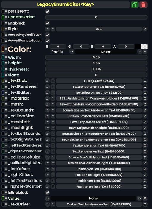
Legacy Enum Editor`1 component as seen in the Scene Inspector

The LegacyEnumEditor component is used to cycle between enums. It is Legacy content migrated from other platforms. This should not be used, and replaced whenever possible.
Fields
| Name | Type | Description |
|---|---|---|
persistent
|
Bool | Determines whether or not this item will be saved to the server. |
UpdateOrder
|
Int | Controls the order in which this component is updated. |
Enabled
|
Bool | Controls whether or not this component is enabled. Some components stop their functionality when this field is disabled, but some don't. |
Style
|
direct RelayRef`1<LegacyUIStyle> | The source of the legacy color styles for this component. |
AcceptPhysicalTouch
|
Bool | Whether to allow Component:TipTouchSources to interact with/activate this component. |
AcceptRemoteTouch
|
Bool | Whether this component allows interaction via the user's interaction laser. |
Color
|
ColorX | The color of the UI. |
Width
|
Float | The width of the UI |
Height
|
Float | The height of the UI. |
Thickness
|
Float | How thick the UI is. |
Slant
|
Float | The beveledness of the UI elements. |
_textSlot
|
Slot | The slot of the text visual for the enum indicator |
_textRenderer
|
TextRenderer | The text renderer of the enum indcator. |
_textEditor
|
TextEditor | The text editor for editing the enum text. |
_material
|
reference drive of PBS_RimMetallic | The material of the UI. |
_mesh
|
reference drive of BevelStripeMesh | The mesh of the ui. |
_textBounds
|
field drive of Float2 | The field that is used to make the UI wrap around the text |
_colliderSize
|
field drive of Float3 | The size of the collider for the UI. |
_meshLeft
|
reference drive of BevelStripeMesh | The mesh of the left cycle button |
_meshRight
|
reference drive of BevelStripeMesh | The mesh of the right cycle button |
_textLeftBounds
|
field drive of Float2 | The field to make the UI wrap around the left button text. |
_textRightBounds
|
field drive of Float2 | The field to make the UI wrap around the right button text. |
_leftTextRenderer
|
TextRenderer | The renderer for the text of the left button. |
_rightTextRenderer
|
TextRenderer | The renderer for the text of the right button. |
_colliderLeftSize
|
field drive of Float3 | The collider field to drive to make the collider envelop the left UI. |
_colliderRightSize
|
field drive of Float3 | the collider firld to drive to make the collider envelop the right UI. |
_leftOffset
|
field drive of Float3 | The field to drive for the left button offset. |
_rightOffset
|
field drive of Float3 | The field to drive for the right button offset. |
_leftTextPosition
|
field drive of Float3 | The field to drive for the left text position. |
_rightTextPosition
|
field drive of Float3 | The field to drive for the right text position. |
IsEnabled
|
Bool | Whether this Legacy UI element is enabled and usable. |
Value
|
E | The Enum that this component has selected. |
_textDrive
|
field drive of String | The string field to drive with the string version of the selected enum from Value.
|
Sync Delegates
| Method Name | Method type and Arguments. | Is the method hidden? | Description |
|---|---|---|---|
EditingStarted:Action`1<TextEditor>
|
Action`1<TextEditor> | ✓ | |
EditingChanged:Action`1<TextEditor>
|
Action`1<TextEditor> | ✓ | |
EditingFinished:Action`1<TextEditor>
|
Action`1<TextEditor> | ✓ | |
OnLeftTouched:TouchEvent
|
TouchEvent | ✓ | |
OnRightTouched:TouchEvent
|
TouchEvent | ✓ |
Usage
When attaching, the component needs an Enum type for E. But just don't use this component for new content at all.
Examples
This article or section is a stub. You can help the Resonite wiki by expanding it.