|_canvasActive|{{RootFieldType|FieldDrive`1|[[Type:Bool|Bool]]}}|TypeAdv8=true| The active field of the canvas this context menu's visuals are being drawn on.
|_colliderEnabled|{{RootFieldType|FieldDrive`1|[[Type:Bool|Bool]]}}|TypeAdv9=true| The active field of the collider of the context menu to allow interaction with it.
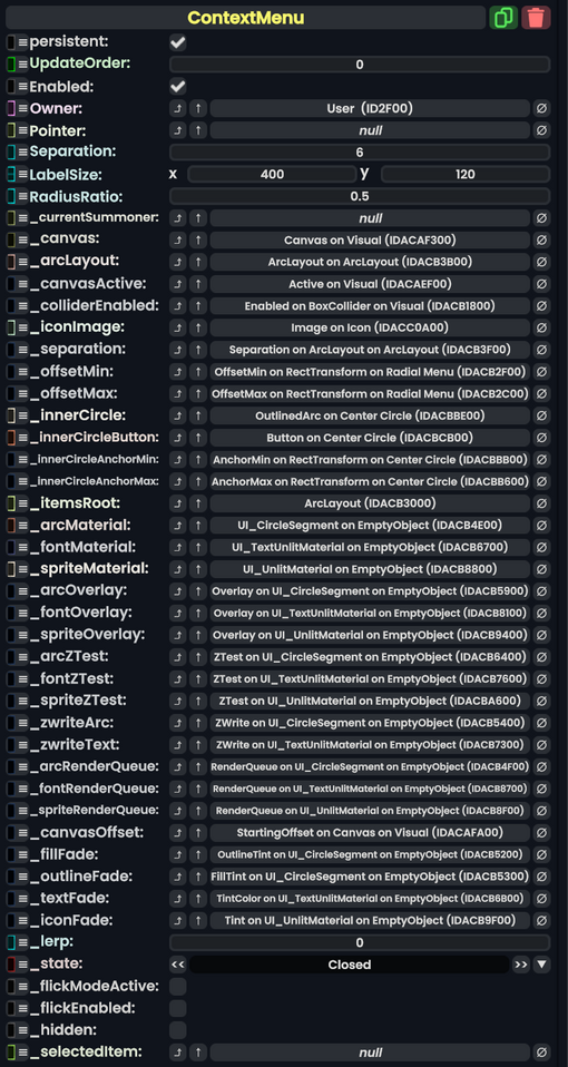
|_iconImage|'''[[Component:Image|Image]]'''|TypeAdv10=true| The icon of the center circle button. Used to display the image of the hovered button option.
|_separation|{{RootFieldType|FieldDrive`1|[[Type:Float|Float]]}}|TypeAdv11=true| The field used to control the separation of button options in the context menu.
|_innerCircleAnchorMin|{{RootFieldType|FieldDrive`1|[[Type:Float2|Float2]]}}|TypeAdv16=true| The anchor min field of the rectangle transform of the inner circle graphic. Used to control how it looks when flicking and changing its size.
|_innerCircleAnchorMax|{{RootFieldType|FieldDrive`1|[[Type:Float2|Float2]]}}|TypeAdv17=true| The anchor max field of the rectangle transform of the inner circle graphic. Used to control how it looks when flicking and changing its size.
|_itemsRoot|Slot|
|_itemsRoot|Slot| the slot that contains all the arc items that makes up the context menu options.
|_spriteMaterial|'''[[UI_UnlitMaterial|UI_UnlitMaterial]]'''|TypeAdv21=true| The material used to render the image sprites on the buttons in the context menu.
|_arcOverlay|{{RootFieldType|FieldDrive`1|[[Type:Bool|Bool]]}}|TypeAdv22=true| The enable Overlay mode on the arc material. Used to control if the context menu should appear ontop of everything else.
|_fontOverlay|{{RootFieldType|FieldDrive`1|[[Type:Bool|Bool]]}}|TypeAdv23=true| The enable Overlay mode on the font material. Used to control if the context menu should appear ontop of everything else.
|_spriteOverlay|{{RootFieldType|FieldDrive`1|[[Type:Bool|Bool]]}}|TypeAdv24=true| The enable Overlay mode on the sprite material. Used to control if the context menu should appear ontop of everything else.
|_arcZTest|{{RootFieldType|FieldDrive`1|[[Type:ZTest|ZTest]]}}|TypeAdv25=true| the Ztest field on the arc material. Used to control if the context menu should appear ontop of everything else.
|_fontZTest|{{RootFieldType|FieldDrive`1|[[Type:ZTest|ZTest]]}}|TypeAdv26=true| the Ztest field on the font material. Used to control if the context menu should appear ontop of everything else.
|_spriteZTest|{{RootFieldType|FieldDrive`1|[[Type:ZTest|ZTest]]}}|TypeAdv27=true| the Ztest field on the spite material. Used to control if the context menu should appear ontop of everything else.
|_zwriteArc|{{RootFieldType|FieldDrive`1|[[Type:ZWrite|ZWrite]]}}|TypeAdv28=true|the Zwrite field on the arc material. Used to control if the context menu should appear ontop of everything else.
|_zwriteText|{{RootFieldType|FieldDrive`1|[[Type:ZWrite|ZWrite]]}}|TypeAdv29=true|the Zwrite field on the font material. Used to control if the context menu should appear ontop of everything else.
|_arcRenderQueue|{{RootFieldType|FieldDrive`1|[[Type:Int|Int]]}}|TypeAdv30=true| the render queue field on the arc material. Used to control if the context menu should appear ontop of everything else.
|_fontRenderQueue|{{RootFieldType|FieldDrive`1|[[Type:Int|Int]]}}|TypeAdv31=true| the render queue field on the font material. Used to control if the context menu should appear ontop of everything else.
|_spriteRenderQueue|{{RootFieldType|FieldDrive`1|[[Type:Int|Int]]}}|TypeAdv32=true| the render queue field on the sprite material. Used to control if the context menu should appear ontop of everything else.
|_canvasOffset|{{RootFieldType|FieldDrive`1|[[Type:Int|Int]]}}|TypeAdv33=true| Used to control if the context menu should appear ontop of everything else.
|CloseMenu:[[Type:ButtonEventHandler|ButtonEventHandler]]|[[Type:ButtonEventHandler|ButtonEventHandler]]|true| Closes the menu if it is currently open.
|OnInnerPressed:[[Type:ButtonEventHandler|ButtonEventHandler]]|[[Type:ButtonEventHandler|ButtonEventHandler]]|true| Called when the context menu inner circle is pressed.
|OnInnerReleased:[[Type:ButtonEventHandler|ButtonEventHandler]]|[[Type:ButtonEventHandler|ButtonEventHandler]]|true| Called when the context menu inner circle is released.
}}
}}
== Behavior ==
== State ==
{{Table EnumValues
== Examples ==
|Closed|0| The menu is currently closed.
|Opening|1| The menu is doing it's opening animation.