|_iconImage|'''[[Component:Image|Image]]'''|TypeAdv10=true| The icon of the center circle button. Used to display the image of the hovered button option.
|_iconImage|'''[[Component:Image|Image]]'''|TypeAdv10=true| The icon of the center circle button. Used to display the image of the hovered button option.
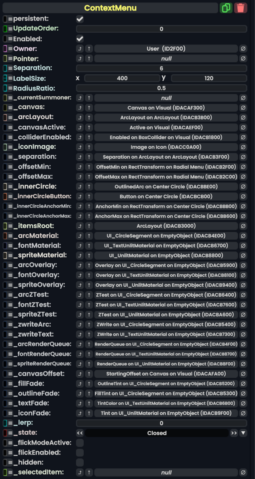
|_separation|{{RootFieldType|FieldDrive`1|[[Type:Float|Float]]}}|TypeAdv11=true| The field used to control the separation of button options in the context menu.
|_separation|{{RootFieldType|FieldDrive`1|[[Type:Float|Float]]}}|TypeAdv11=true| The field used to control the separation of button options in the context menu.
|_offsetMin|{{RootFieldType|FieldDrive`1|[[Type:Float2|Float2]]}}|TypeAdv12=true| The offset min field of the radial menu section
|_offsetMin|{{RootFieldType|FieldDrive`1|[[Type:Float2|Float2]]}}|TypeAdv12=true| The offset min field of the radial menu section
|_offsetMax|{{RootFieldType|FieldDrive`1|[[Type:Float2|Float2]]}}|TypeAdv13=true| The offset max field of the radial menu section.
|_offsetMax|{{RootFieldType|FieldDrive`1|[[Type:Float2|Float2]]}}|TypeAdv13=true| The offset max field of the radial menu section.
|_innerCircle|'''[[Component:OutlinedArc|OutlinedArc]]'''|TypeAdv14=true| The graphic of the inner circle for the context menu
|_innerCircle|'''[[Component:OutlinedArc|OutlinedArc]]'''|TypeAdv14=true| The graphic of the inner circle for the context menu
Line 46:
Line 46:
|_iconFade|{{RootFieldType|FieldDrive`1|[[Type:ColorX|ColorX]]}}|TypeAdv37=true| Is faded by <code>_lerp</code>.
|_iconFade|{{RootFieldType|FieldDrive`1|[[Type:ColorX|ColorX]]}}|TypeAdv37=true| Is faded by <code>_lerp</code>.
|_lerp|Float| Lerps between 0 and 1. 0 for context menu closed and 1 for context menu open.
|_lerp|Float| Lerps between 0 and 1. 0 for context menu closed and 1 for context menu open.
|_state|'''[[#State|State]]'''|TypeAdv39=true| Communicates what opening stage the context menu is in.
|_state|'''[[#State|ContextMenu.State]]'''|TypeAdv39=true| Communicates what opening stage the context menu is in.
|_flickModeActive|Bool| Whether the context menu currently is being flicked.
|_flickModeActive|Bool| Whether the context menu currently is being flicked.
|_flickEnabled|Bool| Whether the context menu currently allows flicking.
|_flickEnabled|Bool| Whether the context menu currently allows flicking.
|_hidden|Bool| Whether the context menu is currently hidden from every user except <code>Owner</code>
|_hidden|Bool| Whether the context menu is currently hidden from every user except <code>Owner</code>
|_selectedItem|'''[[Component:ContextMenuItem|ContextMenuItem]]'''|TypeAdv43=true| The item currently being hovered over by the user's pointer.
|_selectedItem|'''[[Component:ContextMenuItem|ContextMenuItem]]'''|TypeAdv43=true| The item currently being hovered over by the user's pointer.
Line 55:
Line 55:
== Sync Delegates ==
== Sync Delegates ==
{{Table ComponentTriggers
{{Table ComponentTriggers
|CloseMenu()|[[Type:Delegate|Delegate]]<[[Type:IButton|IButton]]: button, [[Type:ButtonEventData|ButtonEventData]]: eventData>| Closes the menu if it is currently open.
|CloseMenu:[[Type:ButtonEventHandler|ButtonEventHandler]]|[[Type:ButtonEventHandler|ButtonEventHandler]]|true| Closes the menu if it is currently open.
|OnInnerPressed:[[Type:ButtonEventHandler|ButtonEventHandler]]|[[Type:ButtonEventHandler|ButtonEventHandler]]|true| Called when the context menu inner circle is pressed.
|OnInnerReleased:[[Type:ButtonEventHandler|ButtonEventHandler]]|[[Type:ButtonEventHandler|ButtonEventHandler]]|true| Called when the context menu inner circle is released.