Automated: update DeDuplicate |
m add info |
||
| Line 3: | Line 3: | ||
|Name=Context Menu | |Name=Context Menu | ||
}} | }} | ||
The '''ContextMenu''' component is the main component that handles the functionality of every user's [[Context Menu]]. | |||
== | == Fields == | ||
{{Table ComponentFields | {{Table ComponentFields | ||
|Owner|User| | |Owner|User| The user that is using this context menu | ||
|Pointer|Slot| | |Pointer|Slot| the slot that represents the pointer the user is interacting with the menu with. | ||
|Separation|Float| | |Separation|Float| How many degrees of separation each arc button has. | ||
|LabelSize|Float2| | |LabelSize|Float2| The size of image labels on the buttons | ||
|RadiusRatio|Float| | |RadiusRatio|Float| The ratio of the button arcs vs the size of the circle in the middle. | ||
|_currentSummoner|{{RootFieldType|SyncRef}}|TypeAdv5=true| | |_currentSummoner|{{RootFieldType|SyncRef}}|TypeAdv5=true| The thing opening the menu currently | ||
|_canvas|'''[[Component:Canvas|Canvas]]'''|TypeAdv6=true| | |_canvas|'''[[Component:Canvas|Canvas]]'''|TypeAdv6=true| The UIX canvas rendering the buttons. | ||
|_arcLayout|'''[[Component:ArcLayout|ArcLayout]]'''|TypeAdv7=true| | |_arcLayout|'''[[Component:ArcLayout|ArcLayout]]'''|TypeAdv7=true| The layout being used to arrange the buttons | ||
|_canvasActive|{{RootFieldType|FieldDrive`1|[[Type:Bool|Bool]]}}|TypeAdv8=true| | |_canvasActive|{{RootFieldType|FieldDrive`1|[[Type:Bool|Bool]]}}|TypeAdv8=true| The active field of the canvas this context menu's visuals are being drawn on. | ||
|_colliderEnabled|{{RootFieldType|FieldDrive`1|[[Type:Bool|Bool]]}}|TypeAdv9=true| | |_colliderEnabled|{{RootFieldType|FieldDrive`1|[[Type:Bool|Bool]]}}|TypeAdv9=true| The active field of the collider of the context menu to allow interaction with it. | ||
|_iconImage|'''[[Component:Image|Image]]'''|TypeAdv10=true| | |_iconImage|'''[[Component:Image|Image]]'''|TypeAdv10=true| The icon of the center circle button. Used to display the image of the hovered button option. | ||
|_separation|{{RootFieldType|FieldDrive`1|[[Type:Float|Float]]}}|TypeAdv11=true| | |_separation|{{RootFieldType|FieldDrive`1|[[Type:Float|Float]]}}|TypeAdv11=true| The field used to control the separation of button options in the context menu. | ||
|_offsetMin|{{RootFieldType|FieldDrive`1|[[Type:Float2|Float2]]}}|TypeAdv12=true| | |_offsetMin|{{RootFieldType|FieldDrive`1|[[Type:Float2|Float2]]}}|TypeAdv12=true| The offset min field of the radial menu section | ||
|_offsetMax|{{RootFieldType|FieldDrive`1|[[Type:Float2|Float2]]}}|TypeAdv13=true| | |_offsetMax|{{RootFieldType|FieldDrive`1|[[Type:Float2|Float2]]}}|TypeAdv13=true| The offset max field of the radial menu section. | ||
|_innerCircle|'''[[Component:OutlinedArc|OutlinedArc]]'''|TypeAdv14=true| | |_innerCircle|'''[[Component:OutlinedArc|OutlinedArc]]'''|TypeAdv14=true| The graphic of the inner circle for the context menu | ||
|_innerCircleButton|'''[[Component:Button|Button]]'''|TypeAdv15=true| | |_innerCircleButton|'''[[Component:Button|Button]]'''|TypeAdv15=true| The button part of the inner circle of the context menu. | ||
|_innerCircleAnchorMin|{{RootFieldType|FieldDrive`1|[[Type:Float2|Float2]]}}|TypeAdv16=true| | |_innerCircleAnchorMin|{{RootFieldType|FieldDrive`1|[[Type:Float2|Float2]]}}|TypeAdv16=true| The anchor min field of the rectangle transform of the inner circle graphic. Used to control how it looks when flicking and changing its size. | ||
|_innerCircleAnchorMax|{{RootFieldType|FieldDrive`1|[[Type:Float2|Float2]]}}|TypeAdv17=true| | |_innerCircleAnchorMax|{{RootFieldType|FieldDrive`1|[[Type:Float2|Float2]]}}|TypeAdv17=true| The anchor max field of the rectangle transform of the inner circle graphic. Used to control how it looks when flicking and changing its size. | ||
|_itemsRoot|Slot| | |_itemsRoot|Slot| the slot that contains all the arc items that makes up the context menu options. | ||
|_arcMaterial|'''[[UI_CircleSegment|UI_CircleSegment]]'''|TypeAdv19=true| | |_arcMaterial|'''[[UI_CircleSegment|UI_CircleSegment]]'''|TypeAdv19=true| The material used to draw the menu options in the context meny. | ||
|_fontMaterial|'''[[UI_TextUnlitMaterial|UI_TextUnlitMaterial]]'''|TypeAdv20=true| | |_fontMaterial|'''[[UI_TextUnlitMaterial|UI_TextUnlitMaterial]]'''|TypeAdv20=true| The material used to render the text for the context menu options | ||
|_spriteMaterial|'''[[UI_UnlitMaterial|UI_UnlitMaterial]]'''|TypeAdv21=true| | |_spriteMaterial|'''[[UI_UnlitMaterial|UI_UnlitMaterial]]'''|TypeAdv21=true| The material used to render the image sprites on the buttons in the context menu. | ||
|_arcOverlay|{{RootFieldType|FieldDrive`1|[[Type:Bool|Bool]]}}|TypeAdv22=true| | |_arcOverlay|{{RootFieldType|FieldDrive`1|[[Type:Bool|Bool]]}}|TypeAdv22=true| The enable Overlay mode on the arc material. Used to control if the context menu should appear ontop of everything else. | ||
|_fontOverlay|{{RootFieldType|FieldDrive`1|[[Type:Bool|Bool]]}}|TypeAdv23=true| | |_fontOverlay|{{RootFieldType|FieldDrive`1|[[Type:Bool|Bool]]}}|TypeAdv23=true| The enable Overlay mode on the font material. Used to control if the context menu should appear ontop of everything else. | ||
|_spriteOverlay|{{RootFieldType|FieldDrive`1|[[Type:Bool|Bool]]}}|TypeAdv24=true| | |_spriteOverlay|{{RootFieldType|FieldDrive`1|[[Type:Bool|Bool]]}}|TypeAdv24=true| The enable Overlay mode on the sprite material. Used to control if the context menu should appear ontop of everything else. | ||
|_arcZTest|{{RootFieldType|FieldDrive`1|[[Type:ZTest|ZTest]]}}|TypeAdv25=true| | |_arcZTest|{{RootFieldType|FieldDrive`1|[[Type:ZTest|ZTest]]}}|TypeAdv25=true| the Ztest field on the arc material. Used to control if the context menu should appear ontop of everything else. | ||
|_fontZTest|{{RootFieldType|FieldDrive`1|[[Type:ZTest|ZTest]]}}|TypeAdv26=true| | |_fontZTest|{{RootFieldType|FieldDrive`1|[[Type:ZTest|ZTest]]}}|TypeAdv26=true| the Ztest field on the font material. Used to control if the context menu should appear ontop of everything else. | ||
|_spriteZTest|{{RootFieldType|FieldDrive`1|[[Type:ZTest|ZTest]]}}|TypeAdv27=true| | |_spriteZTest|{{RootFieldType|FieldDrive`1|[[Type:ZTest|ZTest]]}}|TypeAdv27=true| the Ztest field on the spite material. Used to control if the context menu should appear ontop of everything else. | ||
|_zwriteArc|{{RootFieldType|FieldDrive`1|[[Type:ZWrite|ZWrite]]}}|TypeAdv28=true| | |_zwriteArc|{{RootFieldType|FieldDrive`1|[[Type:ZWrite|ZWrite]]}}|TypeAdv28=true|the Zwrite field on the arc material. Used to control if the context menu should appear ontop of everything else. | ||
|_zwriteText|{{RootFieldType|FieldDrive`1|[[Type:ZWrite|ZWrite]]}}|TypeAdv29=true| | |_zwriteText|{{RootFieldType|FieldDrive`1|[[Type:ZWrite|ZWrite]]}}|TypeAdv29=true|the Zwrite field on the font material. Used to control if the context menu should appear ontop of everything else. | ||
|_arcRenderQueue|{{RootFieldType|FieldDrive`1|[[Type:Int|Int]]}}|TypeAdv30=true| | |_arcRenderQueue|{{RootFieldType|FieldDrive`1|[[Type:Int|Int]]}}|TypeAdv30=true| the render queue field on the arc material. Used to control if the context menu should appear ontop of everything else. | ||
|_fontRenderQueue|{{RootFieldType|FieldDrive`1|[[Type:Int|Int]]}}|TypeAdv31=true| | |_fontRenderQueue|{{RootFieldType|FieldDrive`1|[[Type:Int|Int]]}}|TypeAdv31=true| the render queue field on the font material. Used to control if the context menu should appear ontop of everything else. | ||
|_spriteRenderQueue|{{RootFieldType|FieldDrive`1|[[Type:Int|Int]]}}|TypeAdv32=true| | |_spriteRenderQueue|{{RootFieldType|FieldDrive`1|[[Type:Int|Int]]}}|TypeAdv32=true| the render queue field on the sprite material. Used to control if the context menu should appear ontop of everything else. | ||
|_canvasOffset|{{RootFieldType|FieldDrive`1|[[Type:Int|Int]]}}|TypeAdv33=true| | |_canvasOffset|{{RootFieldType|FieldDrive`1|[[Type:Int|Int]]}}|TypeAdv33=true| Used to control if the context menu should appear ontop of everything else. | ||
|_fillFade|{{RootFieldType|FieldDrive`1|[[Type:ColorX|ColorX]]}}|TypeAdv34=true| | |_fillFade|{{RootFieldType|FieldDrive`1|[[Type:ColorX|ColorX]]}}|TypeAdv34=true| Is faded by <code>_lerp</code>. | ||
|_outlineFade|{{RootFieldType|FieldDrive`1|[[Type:ColorX|ColorX]]}}|TypeAdv35=true| | |_outlineFade|{{RootFieldType|FieldDrive`1|[[Type:ColorX|ColorX]]}}|TypeAdv35=true| Is faded by <code>_lerp</code>. | ||
|_textFade|{{RootFieldType|FieldDrive`1|[[Type:ColorX|ColorX]]}}|TypeAdv36=true| | |_textFade|{{RootFieldType|FieldDrive`1|[[Type:ColorX|ColorX]]}}|TypeAdv36=true| Is faded by <code>_lerp</code>. | ||
|_iconFade|{{RootFieldType|FieldDrive`1|[[Type:ColorX|ColorX]]}}|TypeAdv37=true| | |_iconFade|{{RootFieldType|FieldDrive`1|[[Type:ColorX|ColorX]]}}|TypeAdv37=true| Is faded by <code>_lerp</code>. | ||
|_lerp|Float| | |_lerp|Float| Lerps between 0 and 1. 0 for context menu closed and 1 for context menu open. | ||
|_state|'''[[#State|State]]'''|TypeAdv39=true| | |_state|'''[[#State|State]]'''|TypeAdv39=true| Communicates what opening stage the context menu is in. | ||
|_flickModeActive|Bool| | |_flickModeActive|Bool| Whether the context menu currently is being flicked. | ||
|_flickEnabled|Bool| | |_flickEnabled|Bool| Whether the context menu currently allows flicking. | ||
|_hidden|Bool| | |_hidden|Bool| Whether the context menu is currently hidden from every user except <code>Owner</code> | ||
|_selectedItem|'''[[Component:ContextMenuItem|ContextMenuItem]]'''|TypeAdv43=true| | |_selectedItem|'''[[Component:ContextMenuItem|ContextMenuItem]]'''|TypeAdv43=true| The item currently being hovered over by the user's pointer. | ||
}} | }} | ||
== Sync Delegates == | == Sync Delegates == | ||
{{Table ComponentTriggers | {{Table ComponentTriggers | ||
|CloseMenu()|[[Type:Delegate|Delegate]]<[[Type:IButton|IButton]]: button, [[Type:ButtonEventData|ButtonEventData]]: eventData>| | |CloseMenu()|[[Type:Delegate|Delegate]]<[[Type:IButton|IButton]]: button, [[Type:ButtonEventData|ButtonEventData]]: eventData>| Closes the menu if it is currently open. | ||
}} | }} | ||
== See Also == | == See Also == | ||
* [[Context Menu]] | |||
[[Category:Components:Radiant UI:Context Menu{{#translation:}}|Context Menu]] | [[Category:Components:Radiant UI:Context Menu{{#translation:}}|Context Menu]] | ||
[[Category:Components{{#translation:}}|Context Menu]] | [[Category:Components{{#translation:}}|Context Menu]] | ||
[[Category:Components With Nested Enums{{#translation:}}|Context Menu]] | [[Category:Components With Nested Enums{{#translation:}}|Context Menu]] | ||
Revision as of 20:24, 10 January 2025
Component image 
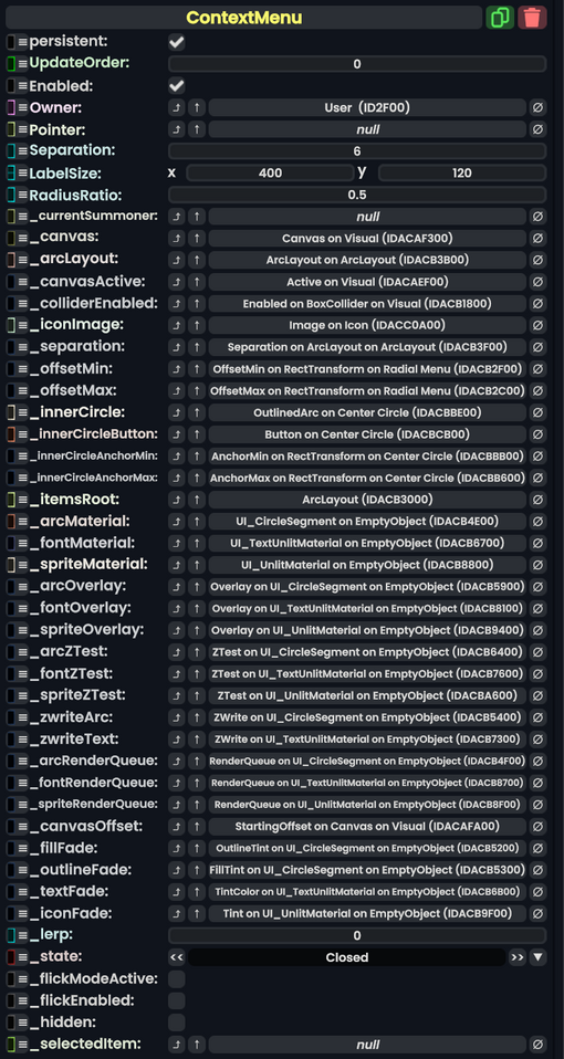
Context Menu component as seen in the Scene Inspector

The ContextMenu component is the main component that handles the functionality of every user's Context Menu.
Fields
| Name | Type | Description |
|---|---|---|
persistent
|
Bool | Determines whether or not this item will be saved to the server. |
UpdateOrder
|
Int | Controls the order in which this component is updated. |
Enabled
|
Bool | Controls whether or not this component is enabled. Some components stop their functionality when this field is disabled, but some don't. |
Owner
|
User | The user that is using this context menu |
Pointer
|
Slot | the slot that represents the pointer the user is interacting with the menu with. |
Separation
|
Float | How many degrees of separation each arc button has. |
LabelSize
|
Float2 | The size of image labels on the buttons |
RadiusRatio
|
Float | The ratio of the button arcs vs the size of the circle in the middle. |
_currentSummoner
|
direct SyncRef | The thing opening the menu currently |
_canvas
|
Canvas | The UIX canvas rendering the buttons. |
_arcLayout
|
ArcLayout | The layout being used to arrange the buttons |
_canvasActive
|
field drive of Bool | The active field of the canvas this context menu's visuals are being drawn on. |
_colliderEnabled
|
field drive of Bool | The active field of the collider of the context menu to allow interaction with it. |
_iconImage
|
Image | The icon of the center circle button. Used to display the image of the hovered button option. |
_separation
|
field drive of Float | The field used to control the separation of button options in the context menu. |
_offsetMin
|
field drive of Float2 | The offset min field of the radial menu section |
_offsetMax
|
field drive of Float2 | The offset max field of the radial menu section. |
_innerCircle
|
OutlinedArc | The graphic of the inner circle for the context menu |
_innerCircleButton
|
Button | The button part of the inner circle of the context menu. |
_innerCircleAnchorMin
|
field drive of Float2 | The anchor min field of the rectangle transform of the inner circle graphic. Used to control how it looks when flicking and changing its size. |
_innerCircleAnchorMax
|
field drive of Float2 | The anchor max field of the rectangle transform of the inner circle graphic. Used to control how it looks when flicking and changing its size. |
_itemsRoot
|
Slot | the slot that contains all the arc items that makes up the context menu options. |
_arcMaterial
|
UI_CircleSegment | The material used to draw the menu options in the context meny. |
_fontMaterial
|
UI_TextUnlitMaterial | The material used to render the text for the context menu options |
_spriteMaterial
|
UI_UnlitMaterial | The material used to render the image sprites on the buttons in the context menu. |
_arcOverlay
|
field drive of Bool | The enable Overlay mode on the arc material. Used to control if the context menu should appear ontop of everything else. |
_fontOverlay
|
field drive of Bool | The enable Overlay mode on the font material. Used to control if the context menu should appear ontop of everything else. |
_spriteOverlay
|
field drive of Bool | The enable Overlay mode on the sprite material. Used to control if the context menu should appear ontop of everything else. |
_arcZTest
|
field drive of ZTest | the Ztest field on the arc material. Used to control if the context menu should appear ontop of everything else. |
_fontZTest
|
field drive of ZTest | the Ztest field on the font material. Used to control if the context menu should appear ontop of everything else. |
_spriteZTest
|
field drive of ZTest | the Ztest field on the spite material. Used to control if the context menu should appear ontop of everything else. |
_zwriteArc
|
field drive of ZWrite | the Zwrite field on the arc material. Used to control if the context menu should appear ontop of everything else. |
_zwriteText
|
field drive of ZWrite | the Zwrite field on the font material. Used to control if the context menu should appear ontop of everything else. |
_arcRenderQueue
|
field drive of Int | the render queue field on the arc material. Used to control if the context menu should appear ontop of everything else. |
_fontRenderQueue
|
field drive of Int | the render queue field on the font material. Used to control if the context menu should appear ontop of everything else. |
_spriteRenderQueue
|
field drive of Int | the render queue field on the sprite material. Used to control if the context menu should appear ontop of everything else. |
_canvasOffset
|
field drive of Int | Used to control if the context menu should appear ontop of everything else. |
_fillFade
|
field drive of ColorX | Is faded by _lerp.
|
_outlineFade
|
field drive of ColorX | Is faded by _lerp.
|
_textFade
|
field drive of ColorX | Is faded by _lerp.
|
_iconFade
|
field drive of ColorX | Is faded by _lerp.
|
_lerp
|
Float | Lerps between 0 and 1. 0 for context menu closed and 1 for context menu open. |
_state
|
State | Communicates what opening stage the context menu is in. |
_flickModeActive
|
Bool | Whether the context menu currently is being flicked. |
_flickEnabled
|
Bool | Whether the context menu currently allows flicking. |
_hidden
|
Bool | Whether the context menu is currently hidden from every user except Owner
|
_selectedItem
|
ContextMenuItem | The item currently being hovered over by the user's pointer. |
Sync Delegates
| Method Name | Method type and Arguments. | Is the method hidden? | Description |
|---|