Introduction
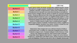
UIX is Resonite's UI system. It allows you to create two-dimensional user interfaces, and is conceptually similar to the Unity UI system. It underpins the Dash Menu and Scene Inspector.
There is a dedicated UIX Category for building UIX and its elements and components.
Demos & Starting Points
A useful UIX demo, UIX Canvas Blank or UIX Canvas Sample, can be spawned with the Developer Tool, found under the Objects category. It provides examples of layouts, images, buttons, and sliders.
Another useful starting point is using the panel in the UI Presets folder provided in the Resonite Essentials folder. Double click the panel item to spawn it, then edit it from there.
There is a UIX Tutorial to put together UIX easily.
Facets
UIX helps with making Facets, customizable Dash add-ons that give the user more functionality in userspace.
Concepts
Canvases
A UI requires a Canvas at its root. The Canvas defines the size of the UI.
The components that utilizes the canvas concept:
| Components | Description |
|---|---|
| Canvas | The root UIX for all your elements. |
| Nested Canvas | A secondary root for UIX elements, this is mainly used to be consistent with the main canvas. |
RectTransforms
Every slot involved in a UI must have a RectTransform on it. RectTransforms are automatically added when you attach other UI components. The RectTransform determines the boundaries of that UI element, expressed as a fraction of the total space available -- so a default RectTransform has anchors at 0,0 and 1,1.
The components that utilizes the RectTransforms concept:
| Components | Description |
|---|---|
| RectTransform | The container designed to hold your UIX elements like buttons, fields, sliders, etc. |
| RectTransformComputedProperties | A component that can return the size of the rect transform and all its contents. |
Layouts
Whilst you can manually position elements by adjusting their RectTransforms, you often want this to be handled automatically. A layout overrides the RectTransforms of its slot's children. For example, the Horizontal Layout component will try to position its children in a horizontal line.
Since layouts depend on the order of their children, and you can't drag children around in the inspector, you must specify a child's OrderOffset property. Normally these are 0, but if you change it, the children will be ordered by increasing OrderOffset, with children of equal OrderOffset being ordered by time of creation of that slot.
Again, if you change the OrderOffset of a child, your layout will have to be recalculated, which may run into the above warning.
The components that utilizes the layout concept:
| Components | Description |
|---|---|
| ArcLayout & ArcSegmentLayout | Creates a layout that arcs around the center, making circular menus. |
| GridLayout | A layout that forms a grid of sized areas, with rows and columns. |
| HorizontalLayout | A layout that lines up elements in a horizontal way. |
| IgnoreLayout | Ignores the above layout in the hierarchy. |
| LayoutElement | Controls how this layout should be shaped, controlled and placed. |
| OverlappingLayout | A layout overlaps or places on top of another layout in the same space. |
| VerticalLayout | A layout that lines up elements in a vertical way. |
Graphics
To actually display things, your UI needs one or more Graphics components. Image will fill the element, optionally taking a material (to define its appearance) and sprite (to define its shape). Other elements include Text, to display text, and Mask, to hide parts of child UI elements.
The components that utilizes the layout concept:
| Components | Description |
|---|---|
| Image | Creates an image component for this graphic UIX element. |
| Mask | Creates a mask for this graphic UIX element. Taking a child slot element and making it the focus, and masking the rest out. |
| Text | Creates a text graphic UIX element, using a string of text as the element. |
Interaction
Interaction components allow for input. Button will respond visibly to hovering and pressing, and will trigger other components on the slot (as well as on child slots). Slider works similarly, but can also control a child element's RectTransform to move it around.
The components that utilizes the layout concept:
| Components | Description |
|---|---|
| Button | Creates a button component element, which will allow a user to press a button to make something happen. |
| Checkbox | Creates a Checkbox component element, which will allow a user to press a toggle button to make something happen based on a state. |
| Slider | Creates a Slider that can allow the user to slide the handle, changing the value. |
| TextField | Creates a TextField that can allow the user to enter text within it. |
| ReferenceRadio & ValueRadio | Creates a radio component value holder. |
Utility
Utilities for UIX are for helper components that can help make UIX either work or do something specific, such as controlling slides and panners, as well as getting rect drivers.
The components that utilizes the utility concept:
| Components | Description |
|---|---|
| AxisMultiViewportPanner | This makes a panner with diferent elements on a UIX canvas, panel, or element. |
ProtoFlux Notes
There is not many ProtoFlux nodes that can interact with UIX, but here is a list of nodes and what you can do with them:
- For interacting with Buttons on a UIX, using the node Button Events can refer to the button being pressed and fire events from that button.
- For interacting with TextField components and listening for a user's actions when they input text, using the nodes in the UI Category may help with this.